Archives for ships and fleets. 'nuff said. Most of the ships here are very very old and will not work in current versions of BSF or SM. You have been warned!
Moderators: th15 , Moderators
gompasta
Lieutenant Commander
Posts: 97 Joined: Thu Oct 18, 2007 12:53 amLocation: Where else?
Post
by gompasta Wed Feb 06, 2008 9:06 pm
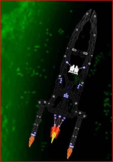
well i had fun making this and its still very unfinished
sorry for the bad image but its too big to get it better
Last edited by
gompasta on Thu Feb 07, 2008 12:03 am, edited 1 time in total.
Im back :)
Kaelis
Moderator
Posts: 1590 Joined: Fri Dec 14, 2007 4:46 am
Post
by Kaelis Wed Feb 06, 2008 9:35 pm
gompasta wrote: sorry for the bad image but its too big to get it better
No, its not. Make a few screenshots of different parts of the ship and then combine them.
Another thing is that its too dark to see any kind of detail.
Siber
Captain
Posts: 319 Joined: Wed Dec 05, 2007 1:43 amLocation: Florida, USA
Post
by Siber Wed Feb 06, 2008 10:14 pm
Detail? I can hardly see the ship , let alone any detail, unless I squint hard. Maybe it looks better in the game with glow colors applied, but this screen just doesn't cut it. Change the colors and try again?
Arcalane
Pseudofeline Overlord
Posts: 4034 Joined: Thu Sep 13, 2007 10:37 amLocation: UK
Post
by Arcalane Wed Feb 06, 2008 10:31 pm
That's the best you can do?
If the core, deflecs/etc. are all unmodified in size then that's pretty small.
Yeah, needs more colour so we can actually SEE it.
/l、
Master Chief
Vice Admiral
Posts: 1235 Joined: Wed Jan 02, 2008 4:27 pmLocation: Elysium
Post
by Master Chief Wed Feb 06, 2008 11:28 pm
Argh, my eyes! You're destroying my eyes!
[b]GONE UNTIL FURTHER NOTICE[/b]
gompasta
Lieutenant Commander
Posts: 97 Joined: Thu Oct 18, 2007 12:53 amLocation: Where else?
Post
by gompasta Thu Feb 07, 2008 12:00 am
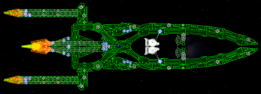
there better now?
and finished
Edit: removed the download link and will edit ships stats
Last edited by
gompasta on Thu Feb 07, 2008 1:44 am, edited 1 time in total.
Im back :)
Arcalane
Pseudofeline Overlord
Posts: 4034 Joined: Thu Sep 13, 2007 10:37 amLocation: UK
Post
by Arcalane Thu Feb 07, 2008 1:37 am
Not better and definitely not finished. You didn't even bother to set the stats!
Bad tiling, bad repetition. Useless floaty aegis.
/l、
gompasta
Lieutenant Commander
Posts: 97 Joined: Thu Oct 18, 2007 12:53 amLocation: Where else?
Post
by gompasta Thu Feb 07, 2008 1:41 am
oops
Im back :)
TormakSaber
Commodore
Posts: 746 Joined: Fri Sep 07, 2007 2:57 am
Post
by TormakSaber Thu Feb 07, 2008 5:52 am
The "Booster flames" at the end of the engines are pretty cool though.
Boba Fettuccini
Rear Admiral
Posts: 775 Joined: Tue Jun 05, 2007 1:27 pmLocation: Everett, WA
Contact:
Post
by Boba Fettuccini Thu Feb 07, 2008 6:25 am
but thats about it though
[center][url]www.boba-fettuccini.com[/url][/center]
Arcalane
Pseudofeline Overlord
Posts: 4034 Joined: Thu Sep 13, 2007 10:37 amLocation: UK
Post
by Arcalane Thu Feb 07, 2008 6:55 am
TormakSaber wrote: The "Booster flames" at the end of the engines are pretty cool though.
Recoloured aegis - not exactly a new concept as far as engine trails go.
/l、
TormakSaber
Commodore
Posts: 746 Joined: Fri Sep 07, 2007 2:57 am
Post
by TormakSaber Thu Feb 07, 2008 7:07 am
Just because something doesn't pioneer or innovate a new concept doesn't mean it can't look cool in its own right, though.
Zeybrin
Lieutenant
Posts: 41 Joined: Thu Feb 07, 2008 7:19 amLocation: Fort Gibson, Oklahoma
Post
by Zeybrin Thu Feb 07, 2008 8:15 am
I like it. . .
I smell information! o_o;
Alunya
Ensign
Posts: 9 Joined: Thu Jan 17, 2008 7:25 am
Post
by Alunya Fri Feb 08, 2008 6:51 am
I like the boosters on the back...that ment to look like flames...maybe chahneg the colours a little bit
Who put pancakes in my silverware draw, Baby don't u mean who put silverware in my pancake draw :P....OWNED
Exethalion
Vice Admiral
Posts: 1033 Joined: Tue Nov 13, 2007 6:36 pmLocation: Stuttgart, DE
Contact:
Post
by Exethalion Fri Feb 08, 2008 7:45 pm
I looked at the first image and thought 'wow, that ship skeleton looks awesome, this is gonna be a whoppa!'.
Then, well, all you did was stretch some bits and finito.
Conclusion: Waaay too much negative space, and those right angles are horrid. The core area is nice, but it really needs some fleshing out.