
Now that that's out of the way.
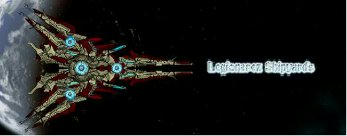
For the Aikawa Kizuna, there are a couple of very minor things that pull away from the general aesthetic. Firstly, the round sections in sets of six. The ones that are closer to the core seem to fall out of the pattern the others have, I think they'd look better if these two were more uniform or the other four less uniform. Secondly, the front glowy things give off the impression that they'd help the flow more if flipped so the rounded end points outwards. And lastly, the outmost pieces with little glowy orbs on them at the back of the wings have the same problem as the previously mentioned round pieces. Try making them more uniform and see how that works? Aside from that it looks great, especially like the connecting struts between the wings and the main body.
For the Nightmare, there's not really much I can criticize, it's superbly well-built, and the orange circles around the guns are an awesome little bit of detail. Maybe lowering the alpha on the red doodads a bit, since they cut through some of the natural depthing of sections and it makes things look just a tiny bit off.
Something rather large
Moderators: th15, Moderators
Re: Something rather large
Fly me to the moon, so I can play among the stars~
Let me see what spring is like on Jupiter and Mars~
Let me see what spring is like on Jupiter and Mars~
-
Water_and_Wind
- Captain

- Posts: 497
- Joined: Wed Sep 12, 2007 3:29 am
Re: Something rather large
The ITS A TRAP sorry couldn't resist battlecruiser is freaking awesome. The sectionwork is pretty much perfect and I have no criticisms. I feel that the shield sections look out of place on this ship by thats just my own opinion. The Nightmare is pretty good too. It looks to me like it can transform into a mecha for whatever reason.
Metagame 2.0 calculator: [url]http://bsf_meta2_calculator.byethost17.com/index.php[/url]
Curvy Alien Fleet: viewtopic.php?t=4959
Thrusallanian Naval Database: Patrol Craft to Behemoth, support ships, stations, warp gates, everything.
http://www.wyrdysm.com/phpBB2/viewtopic ... sc&start=0
Fleets of the Five States, get it here: http://www.wyrdysm.com/phpBB2/viewtopic.php?t=1929
Curvy Alien Fleet: viewtopic.php?t=4959
Thrusallanian Naval Database: Patrol Craft to Behemoth, support ships, stations, warp gates, everything.
http://www.wyrdysm.com/phpBB2/viewtopic ... sc&start=0
Fleets of the Five States, get it here: http://www.wyrdysm.com/phpBB2/viewtopic.php?t=1929

Re: Something rather large
I'm only really going to comment on the Nightmare, its a absolutely amazing ship no question. But, those 2 thick red doodad like bits, seem a bit to glaring, some minor shading and toning down the intensity would be perfect for it.
My sig is under attack by commie mods!
-
Anna

- The artist formerly known as SilverWingedSeraph
- Posts: 3447
- Joined: Wed Sep 26, 2007 8:51 pm
- Location: Elsewhere
Re: Something rather large
Is everyone going to keep mentioning how the red doodads don't blend with the hull at all? I mean... I get that people want to offer constructive criticism with their praise, but could you like... not repeat something that's been mentioned half a dozen times already? That'd be great, ta, thanks.Homer wrote:I'm only really going to comment on the Nightmare, its a absolutely amazing ship no question. But, those 2 thick red doodad like bits, seem a bit to glaring, some minor shading and toning down the intensity would be perfect for it.
As to the Aikawa Kizuna again. I feel that kinda agree with Water and Wind about the shields. To me their placement feels a little off, but it is your ship, and it still looks sweet as it is, so whether you change it or not, I'll be happy either way.
As long as you release downloads eventually. I want.
Founder and Event Coordinator for the BSF Beauty Pageant. Founder of the Pseudo-Chainship Project. Admin. Games Master.
Quality Control Enforcer
Gay cute girl and fucking proud of it.
Quality Control Enforcer
Gay cute girl and fucking proud of it.

Re: Something rather large
I'm getting GDI vibes from the Aikawa Kizuna-class Battlecruiser with its high-tech infrastructure, azure glows and gold-on-silver paint scheme.
The RX-15 Nightmare's sinister shape and colouring is most definitely setting off my Brohood of Nod radar.
Did you play Command & Conquer? If that series ever took off to space, these are the kind of ships I'd imagine representing the two sides.
The RX-15 Nightmare's sinister shape and colouring is most definitely setting off my Brohood of Nod radar.
Did you play Command & Conquer? If that series ever took off to space, these are the kind of ships I'd imagine representing the two sides.
Re: Something rather large
You mean like how you just repeated what five other people had more or less said already, without adding anything useful? 
No useful criticism from me i think, mostly blind praise.
beyond the doodads, the details that really strike me on the larger ship are on the wings. The struts and outermost extensions have great lines and layering. Actually if it weren't for those mechanical parts and the rest of the detail, it almost would look too whimsical to be a ship. i think you definitly succeeded in your first statement about inspiration.
The police style ship actually does remind me of the police vehicles in several different anime Ive seen, or Cyber Sled if it had a glow under it as a hover vehicle... My preferance would be to position the missile launchers a bit differently but again the details like the little insignias make up for it. When I look at the main turret I see room for a smaller caliber side-slung weapon, maybe a machine gun or something, but it might overcrowd things. Rather than try to alter what is damn near perfect, I will try to take inspiration from your designs to improve my own. Excellent showing.
Re: Something rather large
Since my cnc got removed, I'll post it again.
Change the yellow on the battlecruiser to a more orange. Front doesn't exactly flow as well as it could to the back. Also angling the blue aegis back wings might help keep the flow and keep overall coherency.
On the nightmare, color scheme is... idk. Could you try changing the red to a more yellow? The black things sticking out on the sides also contradict the flow.
And you are Eri right? I mean the style of building is just so similar. The use of curves, repetition... Also the naming, I've noticed a lot of the names Eri used come from Japanese words and such. You have done the same and the way you post your ships is also just... similar.
Idk, probably my imagination.

Re: Something rather large
I thought you were gone?25000st wrote:And you are Eri right? I mean the style of building is just so similar. The use of curves, repetition... Also the naming, I've noticed a lot of the names Eri used come from Japanese words and such. You have done the same and the way you post your ships is also just... similar.
Idk, probably my imagination.
But no, it's not Eri. Or at least, we're pretty sure it isn't. Eri is too much of a narcissist and can't go five minutes without slipping some reference to his own works in, like fuel rods. Unless he's trying really hard to change and has basically come back with an entirely different personality.
I honestly don't have much to say about the ships themselves, except that the Nightmare might look better with the front set of spikes/antennae removed. The rear missile racks might look a bit better if they were recoloured to match the rest of the hull too.
Oh, maybe get a new shield sprite for the Aikawa Kizuna. That one you're using now isn't going to work for everything, after all.
/l、
゙(゚、 。 7
l、゙ ~ヽ
じしf_, )ノ
゙(゚、 。 7
l、゙ ~ヽ
じしf_, )ノ
Re: Something rather large
Why should he change the colours? Do the they mix badly? Do they glare against the silver or blue-gray hull medium? Are they too saturated? Non-complementary? Glaring? Too dark? Too dull? Why should he change them?25000st wrote:Since my cnc got removed, I'll post it again.
Change the yellow on the battlecruiser to a more orange. Front doesn't exactly flow as well as it could to the back. Also angling the blue aegis back wings might help keep the flow and keep overall coherency.
On the nightmare, color scheme is... idk. Could you try changing the red to a more yellow? The black things sticking out on the sides also contradict the flow.
And as far as the pointy things on the RX-15 Nightmare, I am assuming they are functional bits (sensors?). Further more, they don't really mess with the flow since it's easy to tell apart from the ship silhouette. In fact their facing is perpendicular to the ship's outline, therefore accentuating the flow, not contradicting it. Don't give advice on aspects of STARSTRUCK's vessels if you're not familiar with concepts behind those aspects that are the staple of ship design.
-
AssassinVrxz
- Lieutenant Commander

- Posts: 76
- Joined: Sat Mar 06, 2010 1:49 pm
Re: Something rather large
who cares about colors, the ship design is wonderfull. its a work of art, not something i could actually see fighting well without bumping up some numbers, but otherwise its fine. its great actually. nothing is wrong with it, although i have trouble figuring out whatsome things are. i have to say, you all are praising his color scheme and stuff, but are the colors really the most important thing on a ship. i think that should be preferance, not something weshould change. but then again, nobody cares whati have to say anywyas.Squishy wrote:Why should he change the colours? Do the they mix badly? Do they glare against the silver or blue-gray hull medium? Are they too saturated? Non-complementary? Glaring? Too dark? Too dull? Why should he change them?25000st wrote:Since my cnc got removed, I'll post it again.
Change the yellow on the battlecruiser to a more orange. Front doesn't exactly flow as well as it could to the back. Also angling the blue aegis back wings might help keep the flow and keep overall coherency.
On the nightmare, color scheme is... idk. Could you try changing the red to a more yellow? The black things sticking out on the sides also contradict the flow.
And as far as the pointy things on the RX-15 Nightmare, I am assuming they are functional bits (sensors?). Further more, they don't really mess with the flow since it's easy to tell apart from the ship silhouette. In fact their facing is perpendicular to the ship's outline, therefore accentuating the flow, not contradicting it. Don't give advice on aspects of STARSTRUCK's vessels if you're not familiar with concepts behind those aspects that are the staple of ship design.
Re: Something rather large
nice ships especially the second one great colour scheme and design but there is alot of yellow on the first intersting shape to it though
and i agree colours are not vital but everyone likes something to look pretty
and i agree colours are not vital but everyone likes something to look pretty
"I put no stock in religion. By the word religion I have seen the lunacy of fanatics of every denomination be called the will of god. I have seen too much religion in the eyes of too many murderers. Holiness is in right action, and courage on behalf of those who cannot defend themselves, and goodness. " Kingdom of heaven.
Re: Something rather large
They don't mix badly but a more orange will be theoretically closer to complimentary colors. Yellow I guess is almost its triad but not really.Squishy wrote:Why should he change the colours? Do the they mix badly? Do they glare against the silver or blue-gray hull medium? Are they too saturated? Non-complementary? Glaring? Too dark? Too dull? Why should he change them?
Actually they do mess with the flow. And perpendicular is EXACTLY messing with the flow. Therefore you have proven your point wrong.And as far as the pointy things on the RX-15 Nightmare, I am assuming they are functional bits (sensors?). Further more, they don't really mess with the flow since it's easy to tell apart from the ship silhouette. In fact their facing is perpendicular to the ship's outline, therefore accentuating the flow, not contradicting it. Don't give advice on aspects of STARSTRUCK's vessels if you're not familiar with concepts behind those aspects that are the staple of ship design.
kthnxbai
Re: Something rather large
So basically you're just throwing suggestions out based on a weak notion to the strict adherence of complementary colours? Great reason. Seeing as the shield glows are intense blue, it only makes sense a stronger colour than orange should partner up with them, like yellow.25000st wrote:They don't mix badly but a more orange will be theoretically closer to complimentary colors. Yellow I guess is almost its triad but not really.
As for the RX-Nightmare... you're really shooting randomly there aren't you?
I don't know whether I should write a few paragraphs explaining the basic concepts of flow, unity and contour or tell you to stop trying so hard to act like you know what you're talking about. Guess which option I'm more likely to take? I'll let you choose:Actually they do mess with the flow. And perpendicular is EXACTLY messing with the flow. Therefore you have proven your point wrong.
kthnxbai
The first option preview:
Flow is broken when your eyes trace a path across an image, and that journey interrupted by sudden intrusions of other lines or very large breaks/splits along the shape.
Take a closer look: If the spiky bits were placed deeper into and on top of the hull, thereby intruding into the RS-15 Nightmare's hull outline, then you have a possible case of perpendicular breaks messing with the flow. However, the spiky bits sit just outside the outside, without crossing it, with a perfect angle to accentuate the direction of the curves.
This is why the perpendicular pieces on the outside of the hull do not mess with the flow, because they do not interrupt it nor leave it broken.
The second option preview:
Get the fuck out of this thread and stop trying to force your vapid tastes onto a promising new member.
Thanks for shopping at PRO ADVICE FOR GIVING PRO ADVICE come again! First one is free but the next will cost you ^_^
Re: Something rather large
I'm not interested in getting in the HoS this week so I'll just continue this with you via PM. Anyhow, a darker orange probably will work better.
-
STARSTRUCK
- Moderator
- Posts: 342
- Joined: Wed Mar 03, 2010 3:46 pm
- Location: sent milady ;)
Re: Something rather large
Aaah, I did not intend to set off this sort of snowballing shitstorm. Either way, I'm not touching the Kizuna. Don't get me wrong, a download will come as soon as procrastination permits.
I've been working on setting up a brand new police fleet, comprised entirely of police ships. That means more decals. Many, many more decals. They are the Elite Anti-Dissenter Police Force of Disneyland With The Death Penalty In Space.
RX-15 Nightmare (now with police lights)

DRX-06 Black Widow

(apologies to any Germans out there, but it just looks scarier in your language.)
I've been working on setting up a brand new police fleet, comprised entirely of police ships. That means more decals. Many, many more decals. They are the Elite Anti-Dissenter Police Force of Disneyland With The Death Penalty In Space.
RX-15 Nightmare (now with police lights)
DRX-06 Black Widow
(apologies to any Germans out there, but it just looks scarier in your language.)