Fair enough, it'd probably look too flat otherwise. However I was more talking about the winglets further out though they might also not look as good if the depthing were changed.Chiiro wrote:I think the parts you're talking about might be intentional, the large parts towards the center right? Yeah I did that on purpose, it looked better than not doing it that way. I'm working on a ship version of it too but it's on hold for now.
So gais.
Moderators: th15, Moderators
Re: So gais.

Re: So gais.
I maek shep, once more.
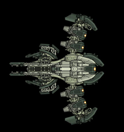
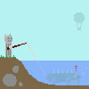
Never got around to naming this one, my computer bluescreened before I managed to save an sb4, oh well.
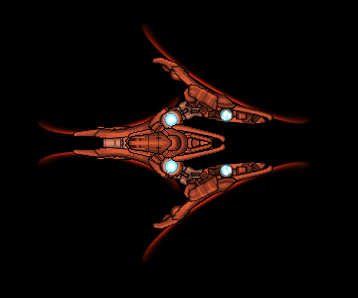
A ship inspired by a girl I know with vibrant red hair and piercing blue eyes.
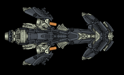
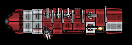
The Crysantheum-class Destroyer.
Nigella-class Battlecruiser.
Never got around to naming this one, my computer bluescreened before I managed to save an sb4, oh well.
A ship inspired by a girl I know with vibrant red hair and piercing blue eyes.
The Crysantheum-class Destroyer.
Nigella-class Battlecruiser.
Fly me to the moon, so I can play among the stars~
Let me see what spring is like on Jupiter and Mars~
Let me see what spring is like on Jupiter and Mars~

Re: So gais.
Most people wouldn't bother to comment because they just think "wow, theres nothing I can say to that"
You deserve no criticism, just mindless praise.
You deserve no criticism, just mindless praise.
naysayers will be shot
Re: So gais.
I'm not a big fan of the darker curving bits on the wings of the third one, they don't fit in well.
The shields sections on the second are a nice idea but they look kinda iffy to me.
Other than that, see doogie's post, these are great. The first one is particularly spectacular
The shields sections on the second are a nice idea but they look kinda iffy to me.
Other than that, see doogie's post, these are great. The first one is particularly spectacular
-
kittenpillar100
- Commander

- Posts: 249
- Joined: Mon Nov 29, 2010 4:34 pm
Re: So gais.
I just died and went to heaven, seriously, that red ship. 'Tis the most wonderous thing ever crafted by man! Those curvy wurvy lines! Thouse spikey wikey shapes! That darn beautiful colour!
You sir, are an artist.
You sir, are an artist.
I think the induction of "LOL" "OMG" and "<3" into the Oxford English Dictionary is a sign of the End Times. Only, instead of a rider on a pale horse, it'll be a gibberish-spewing spastic in a monster truck named "The Dildozer".
Re: So gais.
A ship inspired by a girl I know with vibrant red hair and piercing blue eyes.
Four blue eyes? Seriously though, we need some thin rail sections that do what you did with the shields... Overall very impressive. Your ability to make those horribly unconforming sections blend into larger/curvier/blended shapes is unsurpassed.
Four blue eyes?
Re: So gais.
While that's flattering and all, I don't think it really holds true. There's always things that could be done better, on each and every one of my ships. All I can do is keep trying to improve though.Doogie12 wrote:Most people wouldn't bother to comment because they just think "wow, theres nothing I can say to that"
You deserve no criticism, just mindless praise.
Yeah those darker parts were a bit iffy to me too, I just felt like it was a bit too bland without them there. Oh well, not going to mull over it now, done with it already~Bad Boy wrote:I'm not a big fan of the darker curving bits on the wings of the third one, they don't fit in well.
The shields sections on the second are a nice idea but they look kinda iffy to me.
Other than that, see doogie's post, these are great. The first one is particularly spectacular
"Unsurpassed" is unfortunately not true at all, I think the person who's best at making strange sections work into almost flawless curves is STARSTRUCK.jwa8402 wrote:A ship inspired by a girl I know with vibrant red hair and piercing blue eyes.
Four blue eyes?
Also I made a ship, Anna doesn't like it qq.
I wanted to make something with a uniform armor plating, something that felt like a complete spaceship and not so much like a bunch of pieces plastered together. The only problem with that is that shiny sections don't lend themselves very well to it and I had to keep using the same one section over and over. Overall I think it turned out ok, but leaves much to be desired.
Fly me to the moon, so I can play among the stars~
Let me see what spring is like on Jupiter and Mars~
Let me see what spring is like on Jupiter and Mars~
Re: So gais.
Yeah, more or less what you said. It's not bad but it's not very impressive looking, it's just a not particularly interesting brick. I'm not sure how you could have really fixed that while still accomplishing what you were trying to do. Also the random choice of a couple white panels seems too random to me, I feel it doesn't fit in well with what you were going for.
I do like the touches of asymmetry in gun and section placement, it'd be a lot worse without them.
I do like the touches of asymmetry in gun and section placement, it'd be a lot worse without them.
Re: So gais.
I was bored, I made a ship.
Holla at ya boy.
Holla at ya boy.
Fly me to the moon, so I can play among the stars~
Let me see what spring is like on Jupiter and Mars~
Let me see what spring is like on Jupiter and Mars~
-
kittenpillar100
- Commander
- Posts: 249
- Joined: Mon Nov 29, 2010 4:34 pm
Re: So gais.
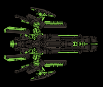
Woah! Neon colours!
Its pretty darn good, I think the grey is just the right shade: not too dark, not too light. The green is a little standy-outy and distracts the eye from the darker sections. Maybe its just me, but if you tone down the green, it will be less, well, eye catching, and the viewer can appreciate the whole ship.
Good ship overall (as always).
I think the induction of "LOL" "OMG" and "<3" into the Oxford English Dictionary is a sign of the End Times. Only, instead of a rider on a pale horse, it'll be a gibberish-spewing spastic in a monster truck named "The Dildozer".
Re: So gais.
It's nice but it'd really like some shading. And maybe less colour disparity between the bright green and the dark grey. That said, the section work and such actually looks really good, recoloured more normally it'd probably look awesome but right now I can't fully appreciate it.
Good stuff all the same though.
Good stuff all the same though.
-
Danny420Dale
- Vice Admiral

- Posts: 1344
- Joined: Sat Sep 22, 2007 2:28 pm
Re: So gais.
I think the Necrons would like that ride, bro. I'd put an extremely subtle green fake aegis on the green bits, though. That ship would also look great with a cobalt blue and red brass color scheme.
Re: So gais.
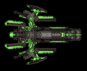
Is that any better?
Fly me to the moon, so I can play among the stars~
Let me see what spring is like on Jupiter and Mars~
Let me see what spring is like on Jupiter and Mars~
-
DoomBringer
- Commander
- Posts: 112
- Joined: Fri Jan 30, 2009 1:01 pm
- Location: Outside Time and Space
Re: So gais.
Yeah the light grey really adds some depth and a bit of 3D feel to the ship. It was rather bland before with only one shade of dark grey.
Keep up the good work. The shape is rather nice and good selection of sections. The green looks a little bit dull, perhaps another shade will fit better? But other than that not much else is wrong with it.
Keep up the good work. The shape is rather nice and good selection of sections. The green looks a little bit dull, perhaps another shade will fit better? But other than that not much else is wrong with it.
Part of being sane, is being a little bit crazy.
Re: So gais.
Much! The ghostly/necron style luminescence helps a lot and cements its style properly. In short, I like it a lot more now.