Archives for ships and fleets. 'nuff said. Most of the ships here are very very old and will not work in current versions of BSF or SM. You have been warned!
Moderators: th15 , Moderators
Eaglehaslanded
Lieutenant
Posts: 26 Joined: Sun Jun 08, 2008 10:15 pmLocation: East side of boredom
Post
by Eaglehaslanded Sun Jun 08, 2008 10:24 pm
Hello all etc.
OK, here are some of my first attempts at shipbuilding. I would really appreciate some criticism so I can improve.
Galaxia:
REMOVED for being bad
Argo:
REMOVED because I couldn't be arsed to colour it
Hood:
REMOVED see above
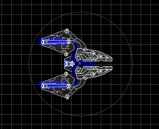
Helcraxë:
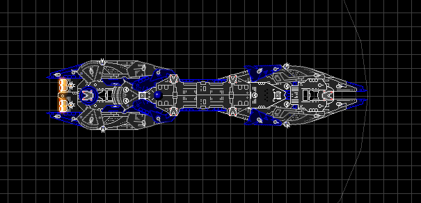
Nemesis II:
Wyre III:
For better or for worse?
That's all so far. Please tell me what you think of them.
Thanks
Last edited by
Eaglehaslanded on Tue Jun 17, 2008 1:10 am, edited 2 times in total.
[img]http://i283.photobucket.com/albums/kk289/Eaglehaslanded11/miserybanner2output.png[/img]
Lizzie
Admiral
Posts: 1685 Joined: Wed Nov 07, 2007 2:03 pm
Contact:
Post
by Lizzie Sun Jun 08, 2008 10:29 pm
Looks pretty good. Needs coloring.
Siber
Captain
Posts: 319 Joined: Wed Dec 05, 2007 1:43 amLocation: Florida, USA
Post
by Siber Mon Jun 09, 2008 2:03 am
Not bad at all. I agree with Lizzie, some adjustment to the colors would be a help. The Galaxia seems a bit messy, too. Might want to try to play with the depth of some of those pieces, maybe. I really like the Wyre.
DeathsHand
Captain
Posts: 397 Joined: Sun Feb 17, 2008 1:54 amLocation: Human Resources
Post
by DeathsHand Mon Jun 09, 2008 2:07 am
All in all, pretty nice! However there seems to be something "off" with the Wyre and Argo's parenting lines.
S͜͟t̷̀̀͟i̷͢ļ̸̕͞l̸̶͞ ̷̢͘͟l̡͟͝u̴̵̸͜͢r̴̸̨k͏͟į̨͜n̛g̸͢͝
Saint Jamez911
Commander
Posts: 230 Joined: Sun Jan 20, 2008 12:33 pm
Post
by Saint Jamez911 Mon Jun 09, 2008 3:16 am
They look nice, but theres also alot of, how good i put it... Clutter i guess you could say, on the first ship. It looks... Over done. But by fare my fav is the Nemesis, its so cool. Its nice and even, not clutterd. It doesn't seem over powered at all. Over all good work
Neroman
Lieutenant Commander
Posts: 61 Joined: Sun Jun 01, 2008 11:54 amLocation: VA,USA
Contact:
Post
by Neroman Mon Jun 09, 2008 4:19 am
I like the nemesis and wyre. My own personal opinion, do a version with the Nemesis the other way with the narrow end in the front.
[img]http://i19.tinypic.com/6ugnpjm.jpg[/img]
Saint Jamez911
Commander
Posts: 230 Joined: Sun Jan 20, 2008 12:33 pm
Post
by Saint Jamez911 Mon Jun 09, 2008 4:27 am
Neroman wrote: I like the nemesis and wyre. My own personal opinion, do a version with the Nemesis the other way with the narrow end in the front.
Agreed
Eaglehaslanded
Lieutenant
Posts: 26 Joined: Sun Jun 08, 2008 10:15 pmLocation: East side of boredom
Post
by Eaglehaslanded Mon Jun 09, 2008 4:40 am
Thanks for all the feedback guys.
[img]http://i283.photobucket.com/albums/kk289/Eaglehaslanded11/miserybanner2output.png[/img]
LordGarcia
Captain
Posts: 271 Joined: Tue Dec 11, 2007 5:37 am
Post
by LordGarcia Mon Jun 09, 2008 4:45 am
hey those already look quite nice! I like the look of the nemesis most.
Himura.Kenshin said: What kind of pure, absolute [i]retard[/i] would run a bomb by Windows?
Eaglehaslanded
Lieutenant
Posts: 26 Joined: Sun Jun 08, 2008 10:15 pmLocation: East side of boredom
Post
by Eaglehaslanded Mon Jun 16, 2008 8:03 pm
*reanimates thread*
I finally got back on the ship maker, and here's what I came up with.
Nemesis 2:
Wyre:
I'm not sure whether this just looks silly now
Sword:
An attempt at something blocky-ish
Helcraxë:
I really like this one.
So, did I get better, or does the colour just look stupid?
[img]http://i283.photobucket.com/albums/kk289/Eaglehaslanded11/miserybanner2output.png[/img]
bien4500
Commodore
Posts: 613 Joined: Wed Dec 05, 2007 8:07 pmLocation: Here and there
Post
by bien4500 Mon Jun 16, 2008 8:32 pm
The Helcraxe is nice, coloring is OK, the Sword is ugly, take a look at mine or Lizzie's ships to get an idea of blockiness. And the Wyre looks silly, get rid of the triangular sections at the back, extend it, place a/an engine mount/s, make the neck thicker, and extend the front too. Make it pointy, with mandibles seen on Lizzie's old fleet.
Hege
Commander
Posts: 170 Joined: Thu Feb 07, 2008 7:56 pm
Post
by Hege Mon Jun 16, 2008 9:00 pm
Not bad at all.
Eaglehaslanded
Lieutenant
Posts: 26 Joined: Sun Jun 08, 2008 10:15 pmLocation: East side of boredom
Post
by Eaglehaslanded Mon Jun 16, 2008 11:49 pm
Wyre II added to topicpost
[img]http://i283.photobucket.com/albums/kk289/Eaglehaslanded11/miserybanner2output.png[/img]
bien4500
Commodore
Posts: 613 Joined: Wed Dec 05, 2007 8:07 pmLocation: Here and there
Post
by bien4500 Tue Jun 17, 2008 5:57 am
The Wyre III is great, and did you get the Hood's name from mine?
Daxx
Captain
Posts: 279 Joined: Fri Feb 15, 2008 9:48 pmLocation: England
Post
by Daxx Tue Jun 17, 2008 7:25 am
bien4500 wrote: did you get the Hood's name from mine?
The Hood is a very famous RL ship, and appears in several SF series. I doubt people are ripping off your ideas specifically.
[/post]