Maarten's wip page.
Moderators: th15, Moderators
Maarten's wip page.
Well, that's enough chitchat new ship:
Using my new section pack, any CnC?
Last edited by Maart3n on Thu Apr 22, 2010 9:08 pm, edited 1 time in total.
Re: Will make up a more interesting title for a ship thread.
dare i say it looks more cluttered than detailed. and the middle rectangular section at the back should be lighter to give the back more depth. I like that sprite pack though.
"I put no stock in religion. By the word religion I have seen the lunacy of fanatics of every denomination be called the will of god. I have seen too much religion in the eyes of too many murderers. Holiness is in right action, and courage on behalf of those who cannot defend themselves, and goodness. " Kingdom of heaven.
-
- Moderator
- Posts: 342
- Joined: Wed Mar 03, 2010 3:46 pm
- Location: sent milady ;)
Re: Will make up a more interesting title for a ship thread.
It ain't exactly good, man. You need to put some life into the shape: Stubby rectangles are not good, "terran" or otherwise. Not so hot about the detailing; if you could zoom out to default, it would give us a better picture.
Re: Will make up a more interesting title for a ship thread.
Short: It's a block with minty sprinkles on it.
Just ... do something to make it not a block to start with.
-
- Captain
- Posts: 355
- Joined: Sat Nov 28, 2009 8:57 am
- Location: Thin air
Re: Will make up a more interesting title for a ship thread.
If your going to use the Dst corp sprites, you should use the ones that had their primary shade brightened to normal SWA sprite levels, that way if you want both light or dark shaded sprites, then you can change they shading. If you use the original Dst sprites, you can't mod their colours much because that start out being a dark shade
Those that live by the sword... get shot by those that don't.
Re: Will make up a more interesting title for a ship thread.
Would you mind looking at the colors?Imaillusion wrote:If your going to use the Dst corp sprites, you should use the ones that had their primary shade brightened to normal SWA sprite levels, that way if you want both light or dark shaded sprites, then you can change they shading. If you use the original Dst sprites, you can't mod their colours much because that start out being a dark shade
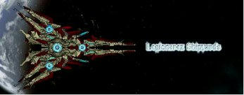
These are grey with blue, the originals are grey/green and orange.
These are my own sprites, and the shading on the ship is a bit subtle.
And if you just looked at the custom content you would see why I made these sprites the way they are.
To everyone that was paying attention and did actually comment on the ship: I guess The brick like shape really didn't come out as planned, but hey let's be honest I haven't build a ship in a year and I had to show of my sprites.
Oh and the bridge sprite has a mirroring error, sorry 'bout that.
Re: Will make up a more interesting title for a ship thread.
New wip ship, need some advise on how to finish it.
I think I will give it 2 long spikes in the front, kinda like the swords from halo.
And it's nowhere near finished.
I think I will give it 2 long spikes in the front, kinda like the swords from halo.
And it's nowhere near finished.
Re: Maarten's wip page.
i agree that would look good, a flying blade! However the red is a bit garish tone it down a bit and ad doodads etc. i like the spiky shape though.
"I put no stock in religion. By the word religion I have seen the lunacy of fanatics of every denomination be called the will of god. I have seen too much religion in the eyes of too many murderers. Holiness is in right action, and courage on behalf of those who cannot defend themselves, and goodness. " Kingdom of heaven.
Re: Maarten's wip page.
So I think I finished it:
The Stormraven.(I'm creative I know)
Glowy gif:
THose 2 balls have slightly less glows under them in normal circumstances, Gimp just lit the glows up slightly.
I'm fully aware of the fact that it gives you epileptic attacks.(It has a white background....)
The Stormraven.(I'm creative I know)
Glowy gif:
THose 2 balls have slightly less glows under them in normal circumstances, Gimp just lit the glows up slightly.
I'm fully aware of the fact that it gives you epileptic attacks.(It has a white background....)
Re: Maarten's wip page.
The sections are well combined, but the structure and flow of the ship are just lacking any sense of function. It just seems a bit like a lump. A well put together lump that would be pretty if the red weren't so harsh, but a lump all the same. Also, the glows don't really fit well with the ship. The color just seems wrong and where you've placed some of them just seems like a waste of space.
Re: Maarten's wip page.
Please use default zoom for screenshots.
-
- Commander
- Posts: 145
- Joined: Mon Feb 16, 2009 10:24 pm
- Location: In America!
- Contact:
Re: Maarten's wip page.
Out of curiosity and being too lazy t ogo and look for it myself, could you tell me where you got that lightning doodad / post it for me?
Re: Maarten's wip page.
3 times the stock shipmaker one and the 2 longer ones are from the fraxy fx pack.
And is the red really that bad, I think we got a screens set rather dark at home.
And And, Kaelis you could have just looked at the gif... Some things just didn't look good at normal zoom.
And is the red really that bad, I think we got a screens set rather dark at home.
And And, Kaelis you could have just looked at the gif... Some things just didn't look good at normal zoom.