Battleships Forever Info | 0.90d released 14 Apr
Moderators: th15, Moderators

I'm probably biased, but I liked the green pop-up box. it was so much more natural and less built-in-Game-Maker-functions.
Has anyone actually complained it was too hard to use? There's been no whining or "how do I do this" topics, and we would see a lot of them if usability was a serious problem.
Has anyone actually complained it was too hard to use? There's been no whining or "how do I do this" topics, and we would see a lot of them if usability was a serious problem.
[b]Ubuntu. Linux for human beings.[/b]
-
Boba Fettuccini
- Rear Admiral

- Posts: 775
- Joined: Tue Jun 05, 2007 1:27 pm
- Location: Everett, WA
- Contact:
Seeing as the color change thing is barely even noticeable... personally, I think it serves no purpose.th15 wrote:I don't have a better solution for the outlines really, colouring the section doesn't work any more because then you can't see any colour changes you make, you'll get used to it.
[center][url]www.boba-fettuccini.com[/url][/center]

Thanks, I can't wait to set up epic battles with Overpowred ships.th15 wrote: KV2: I should be able to allow you to spawn allied ships, I'll try.
Also Btw how come when I click on a Turret It clicks on the ship? I can't even just click on the Moudels eneymore, I have to click on the littie box in the Side thing and its annoying. Plz put it back to the way it wasz.
Major Hong's Ship Rocks!
-
Boba Fettuccini
- Rear Admiral
- Posts: 775
- Joined: Tue Jun 05, 2007 1:27 pm
- Location: Everett, WA
- Contact:
-
Captain Trek
- Commodore

- Posts: 534
- Joined: Thu Jun 21, 2007 12:39 pm
It takes some getting used to, but all you really have to do is hold down the Z key when you want to select a turret or module. You can also do this when attacking an enemy ship to target a weapon or section... It's not too bad really, but I personally think it should be removed as well...
Anyway, I agree the new ship maker is a lot clumbsier than the old one. The new menus do indeed appear out of place and the way sections are highlighted now, as we've already stated, is rediculous because now you have to check three of four times to make sure a particular section is lined up properly... Not to mention the shift key bug...
Anyway, I agree the new ship maker is a lot clumbsier than the old one. The new menus do indeed appear out of place and the way sections are highlighted now, as we've already stated, is rediculous because now you have to check three of four times to make sure a particular section is lined up properly... Not to mention the shift key bug...
The old pop up ship stats system had two problems:
The first was that the way it was programmed was really weird. No offence to Game_boy, it's just the way Game Maker works. Ironically, pausing a game in Game Maker is pretty difficult to do (which is why the in-game pause screen is not going to be improved any). It's dumb and it doesn't make sense but it's just the way the engine is structured. The only pop up ship stats thing worked by essentially bending over backwards to achieve the effect and there were plenty ways it could mess up.
The second thing is that it's not very intuitive. The first time I used the shipmaker myself I was reduced to randomly clicking on the screen to find a way to assign ship values. Then when I got to the screen I wasn't sure how to get out. Currently clicking on the icon on the left is only one way to access ship values, the other way is to right click on the core of the ship.
As for highlighting objects in shipmaker, I'll try to make the outline blink, that would work wouldn't it?
Sean 'th15' Chan
[img]http://img63.imageshack.us/img63/6344/bfbanner2vy5.gif[/img]
[img]http://img63.imageshack.us/img63/6344/bfbanner2vy5.gif[/img]
-
Boba Fettuccini
- Rear Admiral
- Posts: 775
- Joined: Tue Jun 05, 2007 1:27 pm
- Location: Everett, WA
- Contact:
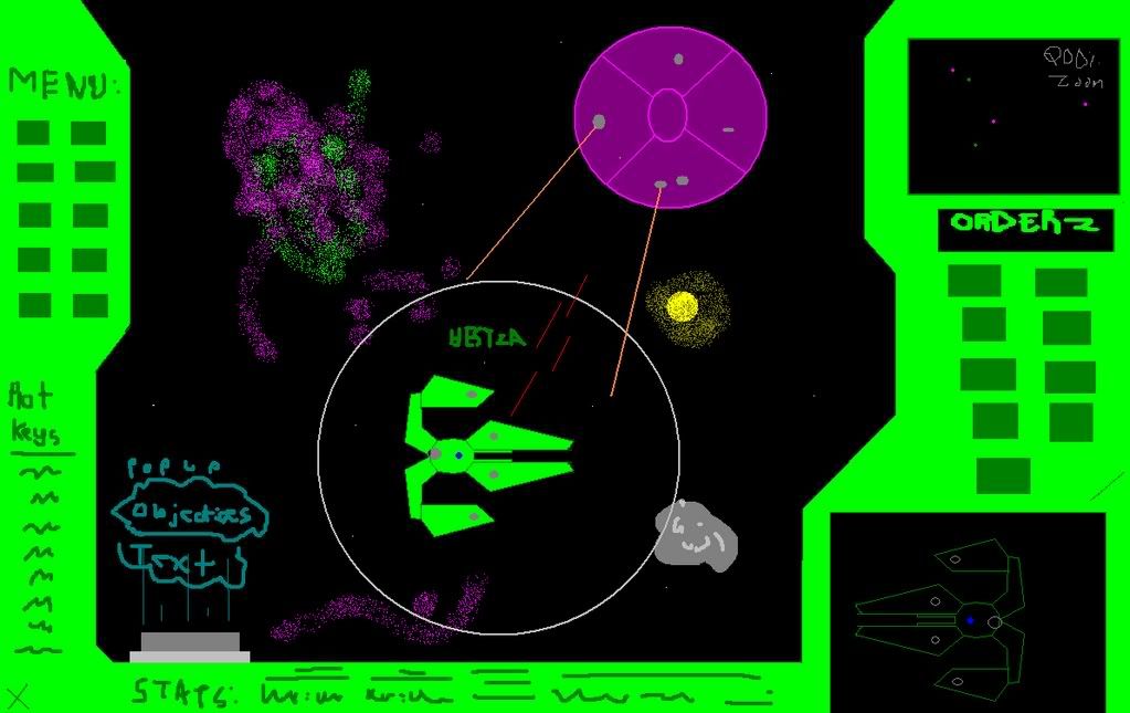
You could easily make it easier by justing adding text to the hestia icon button, like "STATS".
No offense, but you're seeming rather ... stubborn, I guess. You're reasons for the menus being better are pretty lame. If you don't want to use the popup, and the drop-downs suck, then figure something ELSE out. But I truly can't stand this new shipmaker, and in the meantime I will be using the old one.
No offense, but you're seeming rather ... stubborn, I guess. You're reasons for the menus being better are pretty lame. If you don't want to use the popup, and the drop-downs suck, then figure something ELSE out. But I truly can't stand this new shipmaker, and in the meantime I will be using the old one.
[center][url]www.boba-fettuccini.com[/url][/center]
Oh yea, speaking of the colour system, it's not noticeable because you're probably not changing the core colours, which gives you access to even the alien ship colours.
Boba: On the other hand, all of the user justifications here are representative of veteran users, who, quite honestly, will be able to cope with whatever horrible interface I fob on you. However, with the old system new users were quite completely at a lost. Having to hunt for the right key in order to do anything in a program just isn't an acceptable standard any more.
Ideally, the shipmaker should have a full GUI with buttons and such, the drop down menus are just the beginning.
Sean 'th15' Chan
[img]http://img63.imageshack.us/img63/6344/bfbanner2vy5.gif[/img]
[img]http://img63.imageshack.us/img63/6344/bfbanner2vy5.gif[/img]
It seems like you're going pretty far out of the way to change these menus. They really weren't complex at all before; I had it for a day and I figured out how to do everything in it. I daresay that if people couldn't figure out how to use it, they didn't deserve to use it, because it was so exceedingly simple.
-
Boba Fettuccini
- Rear Admiral
- Posts: 775
- Joined: Tue Jun 05, 2007 1:27 pm
- Location: Everett, WA
- Contact:

I'm not a veteran to this whole ship making thing at all; I've only been to this site for maybe about... A week and a half or something? I already had a good idea of how to use the previous ship maker. Heck, I learned how to use the basic keys in just a few minutes and started from there.th15 wrote:On the other hand, all of the user justifications here are representative of veteran users, who, quite honestly, will be able to cope with whatever horrible interface I fob on you. However, with the old system new users were quite completely at a lost. Having to hunt for the right key in order to do anything in a program just isn't an acceptable standard any more.
So yeah. The previous system was not as horrible as you make it out to be. Also, is there any word on a bugfix any time soon? Or is it already out and ready?
What I don't understand is why you guys are bothered about the menus. Aside from deleting sections (for which a hotkey will be added in the next version), all the other hotkeys are still in there.
The next version will also display the current stats in the ship stats menu itself, this was something i missed.
The next version will also display the current stats in the ship stats menu itself, this was something i missed.
Sean 'th15' Chan
[img]http://img63.imageshack.us/img63/6344/bfbanner2vy5.gif[/img]
[img]http://img63.imageshack.us/img63/6344/bfbanner2vy5.gif[/img]
-
Boba Fettuccini
- Rear Admiral
- Posts: 775
- Joined: Tue Jun 05, 2007 1:27 pm
- Location: Everett, WA
- Contact:
hotkeys are no problem. its having to choose from 'delete, change color, resize, flip' when you right clcik. Theres already a hotkey, and I prefered the right click delete.
then you have to choose which stat you want to change when you click the little hestia. it ws much easier (and not to mention cooler) when the gren thing popped up with all the values editable right there.
there, that is why.
then you have to choose which stat you want to change when you click the little hestia. it ws much easier (and not to mention cooler) when the gren thing popped up with all the values editable right there.
there, that is why.
[center][url]www.boba-fettuccini.com[/url][/center]