
shadowbane's first sections
Moderators: th15, Moderators
-
shadowbane

- Lieutenant Commander

- Posts: 50
- Joined: Tue Sep 01, 2009 3:26 am
- Location: Pumpkin world
shadowbane's first sections
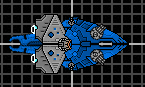
Hi, I have been lurking for quite a while now, and I decided to try to make a few sections. Here are a few I just made. I'm not satisfied with all of them, but I think they are pretty decent. There's no download yet, but if you guys are interested, just say so.
grumpy

These are indeed pretty good. I especially like the bottom left, bottom middle, and top right. Some of the others are starting to look like you threw too many organic lines in there. I try to avoid making boxy sprites like those too rounded or detailed unless they have a purpose, ya know? Doesn't make for good meshing between them. Speaking of that, might take into consideration how some of them would fit together when designing them, ie; like puzzle pieces.
-
Silverware
- Commodore

- Posts: 626
- Joined: Fri Apr 17, 2009 11:50 am
-
shadowbane
- Lieutenant Commander
- Posts: 50
- Joined: Tue Sep 01, 2009 3:26 am
- Location: Pumpkin world
some new pieces
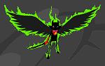
Here are some new pieces. I tried to add more detail. The little black bit sticking out of the bottom right one is a little bit of the core sticking out (since I only know how to take screenshots by arranging my sections in shipmaker). Please comment and give me advice.

grumpy
Re: some new pieces
Wait, really? How did you upload your screenshot? You took the image file and uploaded it to photobucket. Why wouldn't you just do the same with the section file itself?...Unless you mean you didn't know how to arrange them in paint or something.shadowbane wrote:(since I only know how to take screenshots by arranging my sections in shipmaker).
Anyway, sections are improving. Some of them could have slightly sharper angles, but the middle and top on the right are definitely useful.
-
Silverware
- Commodore
- Posts: 626
- Joined: Fri Apr 17, 2009 11:50 am
These new ones are much better.
the detail is nice, probably could use some different shading, to make them appear less flat.
Also if you open two copies of paint and copy and past from one into another you can make a group of different sections easier. Also makes it easier if you use a standard background color and use that as your right click color and set copy and paste to transparent backgrounds.

I think that these are a bit too similar to what I have to be much use. Did you base them on already existing sections or are these entirely original?
This user is a proponent of the whole "Check your **** parenting" idea.
This is a signature. It goes at the end of my post.
Your face is so *adjective* that it *verb*s
This is a signature. It goes at the end of my post.
Your face is so *adjective* that it *verb*s
-
Silver Swordsman
- Commander

- Posts: 247
- Joined: Sat Jan 31, 2009 1:38 pm
- Location: A clustered inhabitance
It doesn't matter. These are his first works: you might as well give him a pat on the back before running him through the morale shredder.Skull13 wrote:I think that these are a bit too similar to what I have to be much use. Did you base them on already existing sections or are these entirely original?
I like them. I like them A LOT. Detailed, yes, generic, yes. but they look sweet, and that's what matters, and that's why people will want to download them. To me, they appear to be a mix of Kae's generic, mecha, and mini styled sections, but hey, you don't get those combinations every day. I look forward to a download, y'hear? Don't let other people discourage you.
If admirals hate and trash your ships,
If you can't get it right;
Then off you go, but don't call quits;
Just go make custom sprites.
Solare:
http://www.wyrdysm.com/phpBB3/viewtopic.php?f=2&t=4858
If you can't get it right;
Then off you go, but don't call quits;
Just go make custom sprites.
Solare:
http://www.wyrdysm.com/phpBB3/viewtopic.php?f=2&t=4858
-
shadowbane
- Lieutenant Commander
- Posts: 50
- Joined: Tue Sep 01, 2009 3:26 am
- Location: Pumpkin world
more sections
Here's another quick update. I couldn't decide what to put in the last spot, so I just stuck some random bullet I made a long time ago there. I will probably make a download when I get like 40 sections. Thanks for all the tips and comments!

grumpy
-
Silver Swordsman
- Commander
- Posts: 247
- Joined: Sat Jan 31, 2009 1:38 pm
- Location: A clustered inhabitance
The bullet is a bit cut off--and you may want to animate that, and straighten the squigglies just a little bit. I'm not going to comment on the sections because I don't know how to comment on them--to me, they're superb.
NOW GIVE YOURSELF A GOOD PAT ON THE BACK AND GET BACK TO WORK.

NOW GIVE YOURSELF A GOOD PAT ON THE BACK AND GET BACK TO WORK.
If admirals hate and trash your ships,
If you can't get it right;
Then off you go, but don't call quits;
Just go make custom sprites.
Solare:
http://www.wyrdysm.com/phpBB3/viewtopic.php?f=2&t=4858
If you can't get it right;
Then off you go, but don't call quits;
Just go make custom sprites.
Solare:
http://www.wyrdysm.com/phpBB3/viewtopic.php?f=2&t=4858
-
shadowbane
- Lieutenant Commander
- Posts: 50
- Joined: Tue Sep 01, 2009 3:26 am
- Location: Pumpkin world

-
Silverware
- Commodore
- Posts: 626
- Joined: Fri Apr 17, 2009 11:50 am