I've been putting this off for a whole fucking week due to RL etc., but here we go. Both of us agree on this order:
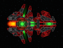
1. Majicnanas's submission wins on account of pulling off a spectacular style with the stock sections while being fairly cohesive about it. The "falling apart" look is very unique, and the glows are tasteful.
Also nostalgia-goggles
2. Doogie12's entry is second for having a very cohesive shape and a great color scheme. The sectionwork is dodgy in places and some parts feel rushed or patched together. I think a bit of TLC time would've helped this ship a lot.
3. Battle Titan's entry has a very garish color scheme, and a lot of parts look hodgepodge (although there are some decent bits, particularly around the centerline). The mangled outline is awful.
4. Chiiro's entry is fourth because although the color scheme is unique and pleasing, the sectionwork is universally terrible and doesn't stand up to close inspection. Again, disastrous outline.
5. Zalausai's entry is dead last because of blobby/haphazard sectionwork and looking generally hideous and janky in both of its forms. Although the articulation is technically impressive, Zalausai seems to have forgotten to make it actually look presentable. There are less retarded ways to do articulated arms, like
such and
such.
I don't think I'll run another contest like this for a while, but it's clear that purely aesthetic comps are out of the question for now. For the next one, a sort of "scenario-based tournament" is in the works, where you'll have to design something that works as good as it looks.