Let's face it, the main attraction of BSF is building your own ships. Share them! If you need help, check the Shipmaker Info & Help forum a little ways down.
This ship is designed for versatility. It is meant to catch up to faster ships that it can defeat, and, if necessary, flee larger, slower dreadnoughts that it can't beat. A bit of a black sheep in the Geisepi navy for this, it is nonetheless a powerful addition and many commodores prefer this to the slower, if mightier, Kusavihla.
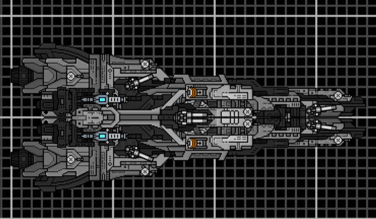
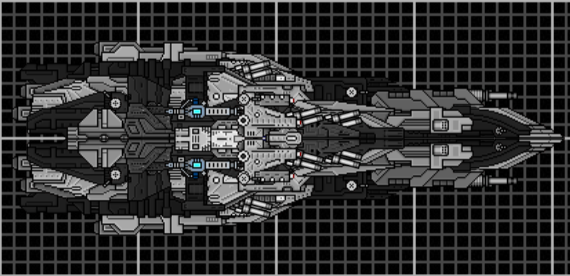
Segetsia Armored Cruiser
The iconic workhorse of the Geisepi Cosmic Navy. This mass-produced, stalwart ship has been in service in one form, or another since the empire's conception. It has a proven battle record and the famous 'war wall' formation has this ship giving it it's defensive strength. It suffers from a fatal flaw as the apparatus supporting it's shield is vulnerable to assault, and Geisepi scientists are working on remedying this with a prototype 'Segetsia Mk. II', and adding advanced particle shielding (deflectors, the ship's been updated since this was taken) to make it even more formidable. As with all of the Segetsia incarnations, it is vulnerable to flanking and having it's shield destroyed.
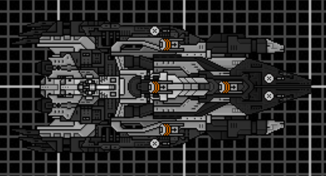
Dugo Torpedo Boat
Although inferior to the Rhonik Huskarl in terms of power, this ship, based on the Segetsia's hull, is built as the yin to the Segetsia's yang. This is a purely offensive vessel, and in sufficient numbers, it's torpedoes can wreak havoc among an enemy with insufficient point defenses. It lack's the Segetsia's shield to make room for the torpedoes and ammunition,. however, so it should stay out of extreme danger whenever possible.
-i like the kurimanka, although that bit of repetition at the back throws me off, but only in the slightest.
-the segetsia... ehh... its a nice concept, but something is left to be desired
-i really like the durgo, with the exception of the blockiness. regardless, i like it
I like the Kurimanka.
Segetsia's shield(?) is too much of a series of bricks for my liking though.
I can't really imagine it having much point. Though it's your fleet and my imagination is all but creative.
Don't you have stuff to do?
Ya know. The important things.
I find it a bit odd that there are random black sections on the ship (or to be more precise, sections which are so dark that it's difficult to see the detailing on them)
Also, you need to use sections which are more detailed. E.g with the first ship, the front half is okay, but in the back, you've used sections which are rather flat, and it looks out of place compared with the rest of the ship.
Those that live by the sword... get shot by those that don't.
Imaillusion wrote:I find it a bit odd that there are random black sections on the ship (or to be more precise, sections which are so dark that it's difficult to see the detailing on them)
Also, you need to use sections which are more detailed. E.g with the first ship, the front half is okay, but in the back, you've used sections which are rather flat, and it looks out of place compared with the rest of the ship.
It's supposed to have been painted. The Geisepis' coloring is black and white.
The back sectioning, yeah I'll admit, my creative juices puttered out, but I was shooting for a smooth look in the back to simulate shielding for the engines (you don't want anti-matter engines to be open, y'know).
----------
The shield, again, it may be because the Segetsia was supposed to be about twice the size it is now, putting it securely into dreadnought territory, basically being that I was concentrating on the shield. I'll admit the effect shows. Not as bad as the previous version, but still. I'm going to just integrate the bitch into the hull and be done with it. It'll almost have to look better that way.
Or you can mount the shield to a section that uses a point defence weapon as a driver.
It can be a bit annoying to properly make at times but the end effect is a shield used pretty much like the board on your avatar's back.
Oh and it can be smaller.
Areze wrote:
The back sectioning, yeah I'll admit, my creative juices puttered out, but I was shooting for a smooth look in the back to simulate shielding for the engines (you don't want anti-matter engines to be open, y'know).
To be honest, you're probably better off not armouring any of that except for the stuff generating whatever technobabble containment field keeping it from going poof.
I'd be more worried about power outages letting the stuff loose and blowing up everything it touches. Which would of course be the ships entire arse.
Don't you have stuff to do?
Ya know. The important things.
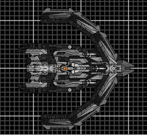
A titan of a ship, the Kusavihla has few true equals in the void of battle. It has a range of powerful weaponry, heavy army, and great point defense, making it an iconic and intimidating (if glacially slow) battleship. A favorite of Battlemasters and Warmasters (Geisepi admiral equivalents; The Warmaster is like a full admiral while a Battlemaster is more of a rear admiral.) across the empire, this behemoth is rarely alone, making it even scarier; if it is spotted, it has friends close at hand.
For both ships, you're using too much sections that are really bland and flat, and they conflict with the more detailed sections you're using in the middle. Try to make the change from detailed sprites to plain ones more gradual, so it flows better
Those that live by the sword... get shot by those that don't.
Hmm. The Kusavihla and the Kurimanka are almost the same size. Should I make the Kusavihla chunkier, or nerf the size of the Kurimaka? Or, re-class and re-tool the Kurimanka and leave their hulls alone? I am leaning towards the last, as the Geisepsi are meant to be a slow, yet heavy faction, with their fair share of dreadnoughts.
Of course, this is considering whether or not Battlecruisers are supposed to be almost as big as Dreadnoughts.
EDIT:
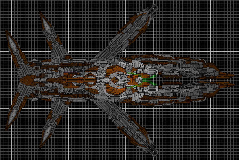
My creation is almost complete! I'm remaking the old Hades. I'm obviously not done yet, I need to add weapons and finishing touches, but the hull has taken the shape I want it to.
EDIT2: The white bits around the green glow has been turned into gray to match the flow.
Brothers, sisters, now is our time! Several hundred years, ago, the confederates killed and raped their way throguh our homeland. Much has changed since then; they unwittingly paid for the tool which shall punish their descendants, who march across the bones of our ancestors! The harbinger, Diablo, Tartarus, Hades, it matters not what it is called, bit shall be the dagger to our enemies' hearts!
I'm afraid that you're going to have to spend a lot more time on this ship, before you even add weapns or finishing touches. A lot of the section work is really messy, the way that the outer sections are connected to the main hull look kinda rushed, and the green glows simply don't work with the current ship
On the upside, the shape looks pretty interesting, and it looks like you've taken in a lot of the advice that has previously been given to you. Keep it up
Those that live by the sword... get shot by those that don't.
You've done a lot of things right here, but it needs a lot of work.
Your section usage is alright on the outer struts, but you have some pretty terribly jumble as you get closer to the middle, especially near the inside of the forward areas.
I could have possibly turned a blind eye to the shade of brown, but the green glow just looks ugly in combination.
You've got a good concept, and with a lot of work on the execution you could have something really good here.
Yeah, not crazy about the glow. It was meant since the Bukhtar colors are brown, gray and green.
About the jumble, part of it was admittedly rushed. I presume you mean the core/glow area? That's because, in part, that I shortened the nose sections considerably. To me,otherwise, it just looked awkward. But I'm sorta confused as to the jumbling, perhaps due to the scale involved with the ship (this is the first one I built this size other than the other one earlier, obviously,this is new territory). So being my second ever 'mega-ship', I think it could be worse.
The part I think I did best was the one directly behind the core, it came out more or less exactly like I wanted it to. Nice and techy.
Also, thanks on the concept/shape. I'm fond of it. I was shooting for an angular/insectile deal, it's based on a supership the bad guys build in a book (series is more like it; this is far in to the future) I'm writing; it was built like this to unnerve its enemies (as well as being humongous, but that's a given).
I'm going to be really blunt here. Your ships aren't very good. Not very good at all. In fact, I'd dare say they're kind of horrible. With the ones earlier on this page, there's sloppy, random section work and stupidly severe contrast between really bright sections and really dark ones, but with this latest ship... I really don't even know what to say.
The shading seems entirely random. There is no rhyme or reason to any of it at all. The sections are cluttered and messy and don't flow together at all. Even the external shape is inconsistent, with the smooth, straight legs, the brick-like rear central portion, and a front portion that is all bumps and chunks and... the whole thing is just generally awkward and I really have nothing nice to say about it at all except that at least it doesn't have the utterly horrible shading that some of the ships earlier on this page do.
Founder and Event Coordinator for the BSF Beauty Pageant. Founder of the Pseudo-Chainship Project. Admin. Games Master. Quality Control Enforcer
Gay cute girl and fucking proud of it.