Page 1 of 1
Yeah don't kill yourselves, I'm back
Posted: Wed Jun 16, 2010 5:19 am
by Zoid Crusader
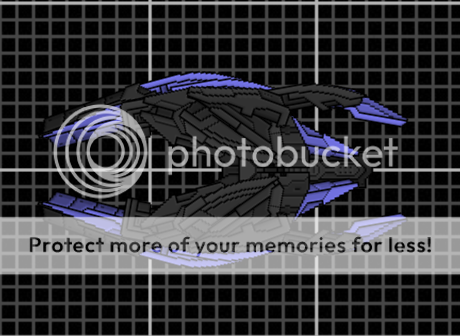
Yes I am back, And with new ships for you to kill


Beetle like cruiser.

Fighter.
Re: Yeah don't kill yourselves, I'm back
Posted: Wed Jun 16, 2010 6:22 am
by Squishy
Why does it have to be so dark?
Re: Yeah don't kill yourselves, I'm back
Posted: Wed Jun 16, 2010 9:10 am
by Anna
Presumably to hide all the ugly. It doesn't really work, though. This ships are really, really, not very good at all. I could list all the reasons, but it would take far too much effort that I just can't be bothered expending, because I just woke up.
Here's a point though: Why would a fighter be almost the same goddamn size as a cruiser?
Re: Yeah don't kill yourselves, I'm back
Posted: Wed Jun 16, 2010 4:24 pm
by STARSTRUCK
I suggest not using that section pack exclusively. It lacks detail. It's ugly. It was a massive brainfart on Kaelis' side IMO. It could complement a good ship if positioned carefully, but otherwise, don't use it.
Re: Yeah don't kill yourselves, I'm back
Posted: Wed Jun 16, 2010 7:17 pm
by GATC
Differently from other, I like the cruiser.
They a simple but "effective".
I don't think this chose of colour is bad, it was not "eyesburning" or too dark to be seen.
For me, you can continue in the way of the cruiser.
(P.S. The other are too habituate to the created by "elite" ship to appreciate simple things ^^)
Re: Yeah don't kill yourselves, I'm back
Posted: Wed Jun 16, 2010 7:46 pm
by Anna
GATC wrote:Differently from other, I like the cruiser.
"Unlike some other people, I like the cruiser."
Learn better English or don't post.
They a simple but "effective".
"They are simple but effective."
And you may mean "defective", because all they're effective at portraying is dark blandness. Also, there was no need to surround "effective" with quotation marks.
I don't think this chose of colour is bad, it was not "eyesburning" or too dark to be seen.
The colours ARE far too dark, unless you have your gamma settings way too high. The purple bits are fine, but the other bits are so dark it hides all detail and makes it look like a flat blob.
(P.S. The other are too habituate to the created by "elite" ship to appreciate simple things ^^)
This sentence, in English, makes no sense. I literally can't even begin to decipher what the fuck you're trying to say here, but whatever it is you're trying to say, I have no doubt it's
fucking stupid.
Re: Yeah don't kill yourselves, I'm back
Posted: Wed Jun 16, 2010 8:18 pm
by Arcalane
Anna wrote:I don't think this chose of colour is bad, it was not "eyesburning" or too dark to be seen.
The colours ARE far too dark, unless you have your gamma settings way too high.
And if your gamma settings are too high, then you really should consider turning them down. Having them up too far is bad for your eyes.
Anna wrote:(P.S. The other are too habituate to the created by "elite" ship to appreciate simple things ^^)
This sentence, in English, makes no sense. I literally can't even begin to decipher what the fuck you're trying to say here, but whatever it is you're trying to say, I have no doubt it's
fucking stupid.
I think what he really means is that everyone here with anything
vaguely regarding taste in good shipbuilding/design is too used to seeing
ships that look good to appreciate these things.
I fail to see how these could be appreciated though, 'cause GNR2 sections are a pile of bland ass and these are just near-black blobs with fairly messy sectionwork.
Re: Yeah don't kill yourselves, I'm back
Posted: Wed Jun 16, 2010 8:22 pm
by Imaillusion
Anna wrote:but the other bits are so dark it hides all detail
It hides the
lack of detail, you should be saying
And yes, these ships are terrible. Since most of the sections are so dark, therefore they are bland. And if they are bland, then they are boring. Boring ship = bad ship
You probaly should make the ships brighter, like Squishy said, and/or use more detailed sections, like Starstruck said. If you can't do either, at least add some doodads to the dark areas, and
try to make it look interesting
Re: Yeah don't kill yourselves, I'm back
Posted: Wed Jun 16, 2010 9:20 pm
by Zoid Crusader
I was told last time I was here to use shipwright parts, Instead of the original parts.
And okay I will make it lighter, but I am keeping the purple and gray.
Re: Yeah don't kill yourselves, I'm back
Posted: Wed Jun 16, 2010 9:56 pm
by Arcalane
Zoid Crusader wrote:I was told last time I was here to use shipwright parts, Instead of the original parts.
And okay I will make it lighter, but I am keeping the purple and gray.
Just using shipwright parts -
particularly those sections - isn't enough to make your ship good by itself. You still have to design them properly, and you can't get away with hiding design flaws under flat, dark colours.
Re: Yeah don't kill yourselves, I'm back
Posted: Thu Jun 17, 2010 12:17 am
by Siber
For the good of mankind,

Or whatever.
I think the first one has some potential, but needs work.
Re: Yeah don't kill yourselves, I'm back
Posted: Thu Jun 17, 2010 9:24 pm
by Skull13
The Prophets of Salril called. They want their shipyard back.
In all seriousness, I like the color scheme. Reminds me of Salrillian ships from Ares. (Their fighters were black and tiny, so they share the same color issues. I'm used to it.)
Keep it up, and I look forward to seeing more of these!
Re: Yeah don't kill yourselves, I'm back
Posted: Fri Jun 18, 2010 3:08 am
by Droid
Tone down on the kae-gnr-sw usage and use more detailed sprites like kae-robo and kae-mechasw to have well...some details!
I'm also an anti-fan of sections not rotated at even intervals of 90 degrees. Seeing something with sections rotated willy-nilly with no sense of direction makes me puke. Just me though.


