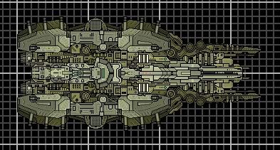
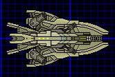
I actually like the "fatness" of the Aries, although I say the clutter in the middle isn't a good idea.
Congrats on being a lurker.
Cynsye's Ships
Moderators: th15, Moderators
-
Silver Swordsman
- Commander

- Posts: 247
- Joined: Sat Jan 31, 2009 1:38 pm
- Location: A clustered inhabitance

-
LactoseTolerant

- Captain

- Posts: 413
- Joined: Mon Oct 05, 2009 10:00 am
- Contact:
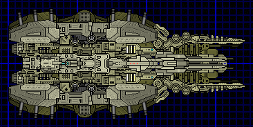
The command deck stands out far too much, as it's the only DST sprite. Integrate it more, or use a different sprite?
Edit: Brain fart .
.
Edit: Brain fart
Last edited by LactoseTolerant on Fri Feb 19, 2010 7:27 am, edited 1 time in total.
-
Silver Swordsman
- Commander
- Posts: 247
- Joined: Sat Jan 31, 2009 1:38 pm
- Location: A clustered inhabitance


lol sorry /end immaturityLactoseTolerant wrote:The command deck stands out fart too much
Perhaps add some pieces around the command deck, something like this?
 Beyond that, not so much a fan of the shape, but I like a lot of the details you put into it. Just has a bit too much of a beetlish look to it. I hope you use all those circles from the mecha sprites as bases for weapons or equipment.
-
Imaillusion
- Captain
- Posts: 355
- Joined: Sat Nov 28, 2009 8:57 am
- Location: Thin air
I see a problem. Can you see how there's that dark olive green section areas anround the middle. Some of the outer section actually overlap the innner sections, making the impression that the outer sections stand higher up. Make it so the very middle sectons of the ship go over the ones further out, and those sections over over the ones that are even more further out, and so on. That way, those outer sections don't stick out as much.
Also, I don't have any problems with the clutter, but i suggest you change the colouring, that dark olive-green stands out too much. I think that's why people say there's clutter
Also, I don't have any problems with the clutter, but i suggest you change the colouring, that dark olive-green stands out too much. I think that's why people say there's clutter
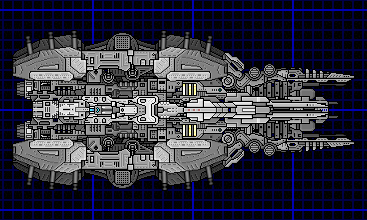
Sorted quite a few depthing errors I missed (Doh) and changed to an "Alliance" colour scheme.
Been reading around as well, and I'm playing around with the meta 2.0 design rules, starting small.
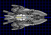
So, I give you the Kallichore class corvette:
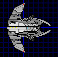
Size 60, armed with a pair of Vulcans and a Missile Launcher, and a full set of attitude thrusters. Found it interesting to work with a limit on sprites. Makes you think more about how certain ones go together.
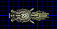
And the Anthe class gunboat:
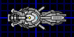
Size 43, armed with three AC's.
Last edited by Cynsye on Sat Feb 20, 2010 3:36 am, edited 1 time in total.
-
Silver Swordsman
- Commander
- Posts: 247
- Joined: Sat Jan 31, 2009 1:38 pm
- Location: A clustered inhabitance
I still think the middle of the ship is a bit cluttered. The second small ship looks really good, but I'm not a fan of the wing shape
If admirals hate and trash your ships,
If you can't get it right;
Then off you go, but don't call quits;
Just go make custom sprites.
Solare:
http://www.wyrdysm.com/phpBB3/viewtopic.php?f=2&t=4858
If you can't get it right;
Then off you go, but don't call quits;
Just go make custom sprites.
Solare:
http://www.wyrdysm.com/phpBB3/viewtopic.php?f=2&t=4858
-
Anna

- The artist formerly known as SilverWingedSeraph
- Posts: 3447
- Joined: Wed Sep 26, 2007 8:51 pm
- Location: Elsewhere
I disagree entirely about clutter in the middle. There's a damn lot of detail, yes, but it's neat and well structured detail that doesn't burn the eyes. I kinda like it. Have you been lurking a long time, Cynsye? Or are you an older member come back under a new name? Either way, your shipbuilding skills are quite impressive for someone so new to the forums. Bravo.
Founder and Event Coordinator for the BSF Beauty Pageant. Founder of the Pseudo-Chainship Project. Admin. Games Master.
Quality Control Enforcer
Gay cute girl and fucking proud of it.
Quality Control Enforcer
Gay cute girl and fucking proud of it.
Thanks. Well.. its not really either of them. Downloaded the game on Friday last week, and messed around making a few old-style ships. Came looking for more sprites on Monday and well.. it went on from thereAnna wrote:I disagree entirely about clutter in the middle. There's a damn lot of detail, yes, but it's neat and well structured detail that doesn't burn the eyes. I kinda like it. Have you been lurking a long time, Cynsye? Or are you an older member come back under a new name? Either way, your shipbuilding skills are quite impressive for someone so new to the forums. Bravo.
I have played a lot of GalCiv II, and Garry's mod so I have quite a bit of experience building things up from parts, which translates well into this.. being 2d is far easier than GMod and GalCiv as well.
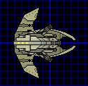
Another ship: Siarnaq class frigate.
Size 80, and armed with 2 Vulcans, 2 H Vulcans, and 2 Missile Launchers.
I've been getting a weird bug sometimes when I have been making ships, where it will spew out a string of errors about modules and weapons that nothing but replacing them fixes. Anyone heard anything about that?
Yeah, it's not that bad, it's just it doesn't like it sometimes when you mirror a depthed weapon. To be on the safe side always mirror weapons then depth. And on the ships. Damned impressive work for a first timer, all nicely thought through ships, with good section work to match 
"Damn hippies with their slippers and mesh bags looking for "adventure" or friggin' nerds who hasn't held anything but a microscope in their girly little hands. Such posers don't last long here." - Wolf (S.T.A.L.K.E.R.)
I tend to not use mirroring.. I know it would save me time but I like to make sure everything is where I want it.. plus it would break some of my usual spinal sprites, as they have to be offset by 0.5 to centre them. I guess cloning would have the same effect?Rugdumph wrote:Yeah, it's not that bad, it's just it doesn't like it sometimes when you mirror a depthed weapon. To be on the safe side always mirror weapons then depth. And on the ships. Damned impressive work for a first timer, all nicely thought through ships, with good section work to match
If you want olive colouration I have them in that as well
-
LactoseTolerant
- Captain
- Posts: 413
- Joined: Mon Oct 05, 2009 10:00 am
- Contact:
The olive color fits well. The Anthe is well done, nice and small. The Kallichore's center sprite stands out from the rest of the ship, it's size seems disproportionate. The Siarnaq feels a bit "flat" from the outer gnr-sw sprites, but no other complaints there.
 .
.
Don't take that lightly. Anna hardly gives positive reviews, so take it as a big accomplishment. I've been around for a bit, and i've hardly gotten noticed="Anna"] I disagree entirely about clutter in the middle. There's a damn lot of detail, yes, but it's neat and well structured detail that doesn't burn the eyes. I kinda like it. Have you been lurking a long time, Cynsye? Or are you an older member come back under a new name? Either way, your shipbuilding skills are quite impressive for someone so new to the forums. Bravo.