Page 2 of 5
Re: The curvy alien fleet
Posted: Tue Feb 09, 2010 12:37 pm
by Water_and_Wind
Kaelis wrote:
Now, as for the cruiser: the flow is fine, but i think you went to far - at this size, stuff starts to blur together and get 'flat', so you need something more to make it interesting; something special to make it stand out. But, noone forces you to make it this big, right? In fact, you could split it up into two or even three different ships. Which would be awesome.
I certainly understand the problems with the cruiser, but I am planning to build even bigger ships, simply because they're that much more challenging.
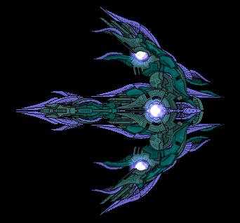
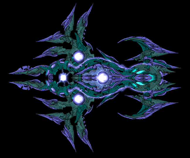
Dubbing this the Ray Destroyer for lack of a better name.
Posted: Tue Feb 09, 2010 3:14 pm
by Water_and_Wind
So I fucked around with glows (made the core smaller too), not sure whether to call it an improvement or not. I hope to settle on a good glow scheme by means of reduction. So which glows should be removed, or all of the green ones, and should they be a different colour or colours?
Re: The curvy alien fleet
Posted: Tue Feb 09, 2010 6:37 pm
by Arcalane
Kaelis wrote:I like (?) how Arc comments twice on stuff people have said, but fails to comment on the ships themselves, not to mention praising them as deserved. Bah, humbug.
I feel no praise is necessary, for it has already been said by others. Besides, if you read it right...
Arcalane wrote:Not to say that couldn't change...
...or is that too subtle for you to comprehend?

Posted: Wed Feb 10, 2010 2:01 am
by Skull13
Reminds me of the ships of the Ancients from Freespace 2 (Although they're all fan-designed) Nevertheless, there's a flow that I never thought possible on BSF ships. Good job.
Posted: Wed Feb 10, 2010 12:23 pm
by Water_and_Wind
Light Destroyer
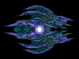
I decided not to add more glows after all. Too lazy to upgrade the whole fleet and it distracts from the sectionwork.
Posted: Wed Feb 10, 2010 1:38 pm
by Silverware
Oh that light destroyer is COOL.
The form just flows perfectly from the front to the back, and each successivly lower layer follows nicely with it.
The only part that I can see that doesn't fit too well is the oval area on the middle back, it seems like it doesn't belong.
But the rest is great, keep up the awesome work.
Posted: Wed Feb 10, 2010 1:58 pm
by Water_and_Wind
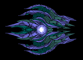
You mean something like this?
Posted: Wed Feb 10, 2010 3:37 pm
by Silverware
Awesome, yeah that fixed it.
Now that is a killer ship. And will not take much to increase its size.
=P
Posted: Thu Feb 11, 2010 5:43 am
by 25000st
HS! IMO
Lol
BSF, this is what is called flow. Water And Wind, why haven't you posted more ships before?
Posted: Thu Feb 11, 2010 2:01 pm
by Water_and_Wind
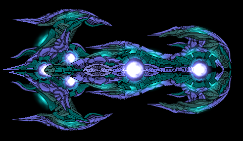
BATTLECRUISER
Posted: Thu Feb 11, 2010 2:43 pm
by Silverware
Only one word :
WOW
That is awesome It flows well, until the rear wings, im not sure about them, they fit with the style, but not the flow so much. If you can fix that, maybe having them flow upwards and back following the curve set out from the middle stub's of wings, then the flow will be perfect
Posted: Thu Feb 11, 2010 8:42 pm
by Imaillusion
Are these ships animated? Because I really want to look at that rear sparkerly core-thing, it looks sweet.
But yeah, apart from what silverware had said, about the wings protruding out at odd-looking ways, these ships are awsome
Posted: Thu Feb 11, 2010 9:08 pm
by Bad Boy
Awesome. So much better and more in keeping with this style than the cruiser, and all round spectacular. Good job with the white glows, they're perfect, not too big, not too small, and not too numerous.
I quite like the outwards pointing wings (I assume these are the ones people were complaining about), and disagree about pointing them backwards as it would make that area a lot less interesting and cool looking. But it's true that they don't flow as well, perhaps bend/turn them forwards a tiny bit.
Posted: Fri Feb 12, 2010 7:33 am
by 25000st
HS! Coming right up!
Seriously these keep getting better. Keep it up.
Déjà vu C111 (maybe not quite)?
Posted: Fri Feb 12, 2010 7:58 am
by LactoseTolerant

Sorry, I felt that but this one doesn't live up quite well the others. While the outside areas are still superb in their curvyness, some parts of the ship irked me alot.

1: This area seems overly flat due to only a few sections being used.
2: The "_|" piece on the right seems way out of place.
3: The overlap doesn't look very good, and it's quite thin like the area in 1.
4: The TSA sprite there stands out alot more than the back sprites do. I nearly missed it the first time looking at it.
5: The holes. Dark holes.
6: Odd TSA sprite jutting out.
Sorry if this feels a bit... scathing, but I felt that it didn't have alot of the "meatyness" of the previous ships, or the fantastic curves.
Other than those, I still loved the ship, especially the nose section.