Rodgun's Ships
Moderators: th15, Moderators
-
Imaillusion
- Captain

- Posts: 355
- Joined: Sat Nov 28, 2009 8:57 am
- Location: Thin air
Re: Rodgun's Ships
The front still looks a bit blocky to me. It also looks more bulky as well, like you said, but I actually don't mind it, the ship looks more robust as a result. Maybe you could put one of those satellite dishes at the front as well, because there are a lot more doodads at the back than the front, and the front ends up looking a bit bland, as a result
Those that live by the sword... get shot by those that don't.
-
LactoseTolerant

- Captain
- Posts: 413
- Joined: Mon Oct 05, 2009 10:00 am
- Contact:
Re: Rodgun's Ships
Interpolation is throwing me off  .
.
The gunwales are well defined and meld into the ship somewhat well. Some of the depthing on the sprites are odd, namely:
1. The blue DST piece in the rear, being overlapped by a trapezoidal/triangular mecha piece. The large DST square a bit to the right creates a small "cliff" effect.
2. The blue Mecha sprite slightly overlapping the rectangular DST sprite on the mid-front of the ship. It seems to be sharply "grabbing" onto the DST area.
The ship has a good terran feel to it, but most of it goes away with the clutter that builds up on the border mecha pieces. The best part to me seems to be the very front of the ship, a good amount of complexity without much clutter.
-
Rodgun
- Lieutenant Commander

- Posts: 74
- Joined: Mon Jan 18, 2010 4:11 am
- Location: Infront of a computer.
Re: Rodgun's Ships
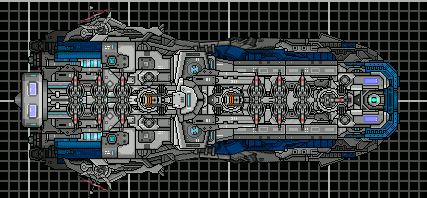
Well, tried to fix the mentioned interpolation issues. Don't know if I succeeded since I'm not really sure exactly where you meant, but noted some issues of my own so I corrected them as well. The front received a single new doodad (yipee...) and moved some of the mecha sprites a bit on the sides to make them fit better.
-
Rodgun
- Lieutenant Commander
- Posts: 74
- Joined: Mon Jan 18, 2010 4:11 am
- Location: Infront of a computer.
Re: Rodgun's Ships
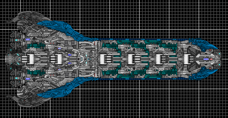
So I took some time to make a sort of Battleship.
Penisbrick Excelsior-class Battleship
I know the back is really messy. I had alot of trouble making it and thats what came out. Appreciate any recommendations for that part. Although, the blue sections on the back are meant to look like that and overlap since they are basically armor pieces. Its the body itself which I'm talking about.
Also, I realize the front may look repetitive but I have an explanation for that. Remember my big shipyard a few pages back? Well, there it said that it produced Battleship components which were then slapped together, and thus that piece of repetition. C&C is appreciated.
-
Imaillusion
- Captain
- Posts: 355
- Joined: Sat Nov 28, 2009 8:57 am
- Location: Thin air
Re: Rodgun's Ships
I think you could make the central command centre a bit more appealing, or interesting, ecause at the moment it kinda blends in with the ship, which is kinda boring to be honest.
You're right in saying the back area is messy, that area with one shade of grey really doesn't look too good. If it got a bit of shading done on it, or even better, if you used that dark teal colour in those areas, like you did with the front half, that back area would look a lot more interesting
You're right in saying the back area is messy, that area with one shade of grey really doesn't look too good. If it got a bit of shading done on it, or even better, if you used that dark teal colour in those areas, like you did with the front half, that back area would look a lot more interesting
Those that live by the sword... get shot by those that don't.

Re: Rodgun's Ships
the ship above itself is nice and consistent for the most part, and i'm not sure which parts you were saying are repetitive because it doesn't look that way to me. the only changes i'd make are that the blue sections at the front need to be darker to make them fit in with the rest of the blue armour and the big dstsw sprite at the back needs to be darker as well because it sticks out like a sore thumb
the battleship is just, well, bad... it really doesn't have that much to say about it because it's too messy and just looks haphazardly thrown together
the battleship is just, well, bad... it really doesn't have that much to say about it because it's too messy and just looks haphazardly thrown together
There is no OP, there is only more boosters...
Re: Rodgun's Ships
The battleships is way to choppy. None of the sections transition well to the other resulting in a cut and paste look.
Much of the ship also (I hate to say it) lacks flow so my eye gets lost in the jumble of sections. The fact that the depthing isn't really there doesn't help matters.
The colors also don't work too well. The turquoise is too dark and doesn't really go with the blue.
The colorful errr.. doodads/details also don't really do anything for the ship.