Archives for ships and fleets. 'nuff said. Most of the ships here are very very old and will not work in current versions of BSF or SM. You have been warned!
Moderators: th15 , Moderators
dgms17
Lieutenant
Posts: 41 Joined: Sat Oct 24, 2009 12:54 amLocation: Earth
Post
by dgms17 Mon Dec 14, 2009 9:04 pm
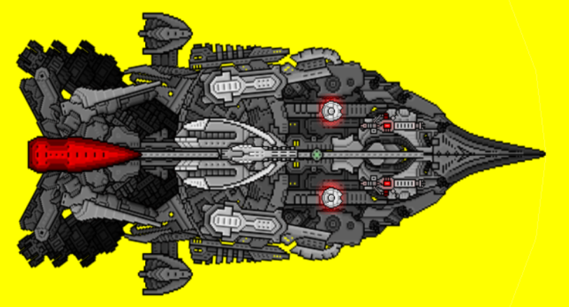
I've been around these forums for a while and someone told me to post my own ships. This isn't my first ship and it's certainly not perfect either.
Sorry about the zoom.
Any feedback is appreciated.
Last edited by
dgms17 on Sun Jan 24, 2010 2:15 am, edited 5 times in total.
I know I should first get the log out of my own eye before putting it into someone else's.
HamanoKinji
Lieutenant, Junior Grade
Posts: 21 Joined: Sat Dec 12, 2009 11:13 pm
Post
by HamanoKinji Mon Dec 14, 2009 9:23 pm
I don't know if my comment could help but i think i'll give it a shot...
[img]http://i342.photobucket.com/albums/o414/valkyrion22/Pivots/Signature.png[/img]
Kiltric
Captain
Posts: 491 Joined: Sat Apr 11, 2009 4:44 am
Post
by Kiltric Tue Dec 15, 2009 12:25 am
It feels very cluttered around the middle, the curved, detailed sections you used don't mesh well with the smooth style of the rest of the ship.
dgms17
Lieutenant
Posts: 41 Joined: Sat Oct 24, 2009 12:54 amLocation: Earth
Post
by dgms17 Wed Dec 16, 2009 2:32 am
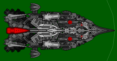
Updated design:
The two 'boosters' are actually beams.
There are some holes in the middle, but that will be fixed.
The nanomatrix reset and I can't change the sprite anymore.
Any other feedback?
I know I should first get the log out of my own eye before putting it into someone else's.
Kiltric
Captain
Posts: 491 Joined: Sat Apr 11, 2009 4:44 am
Post
by Kiltric Wed Dec 16, 2009 4:32 am
It looks good, definitely an improvement. However, the pieces on the sides still look odd. It's not huge, but it's the difference between good and great.
dgms17
Lieutenant
Posts: 41 Joined: Sat Oct 24, 2009 12:54 amLocation: Earth
Post
by dgms17 Thu Dec 17, 2009 3:03 pm
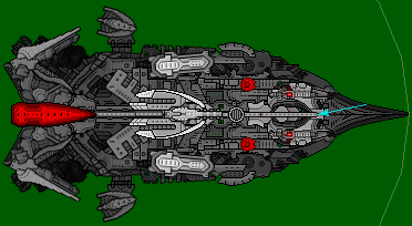
Kiltric wrote: the pieces on the sides still look odd.
Which pieces, to be exact?
Update:
Like this?
I know I should first get the log out of my own eye before putting it into someone else's.
Kiltric
Captain
Posts: 491 Joined: Sat Apr 11, 2009 4:44 am
Post
by Kiltric Fri Dec 18, 2009 4:51 am
the Kae_aln-sw14, and Kae_dtl-sw11
dgms17
Lieutenant
Posts: 41 Joined: Sat Oct 24, 2009 12:54 amLocation: Earth
Post
by dgms17 Sat Dec 19, 2009 5:59 pm
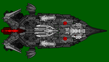
Is it better like this, or should I just remove the sections?
I know I should first get the log out of my own eye before putting it into someone else's.
hazelwooder
Commander
Posts: 106 Joined: Tue Jul 15, 2008 6:48 am
Post
by hazelwooder Sat Dec 19, 2009 7:34 pm
looks better i would suggest the sections you have made darker move change the depth so they are below the ligher sections around them.
dgms17
Lieutenant
Posts: 41 Joined: Sat Oct 24, 2009 12:54 amLocation: Earth
Post
by dgms17 Sat Dec 19, 2009 11:20 pm
hazelwooder wrote: looks better i would suggest the sections you have made darker move change the depth so they are below the ligher sections around them.
Which sections to be exact? I thought I removed those errors.
hazelwooder wrote: I think you should build on the side pods make them out of several sections, they look abit out of proportion with the rest of the ship at the moment.
A friend commented that I should completely remove those side pods, but I like your suggestion more.
I know I should first get the log out of my own eye before putting it into someone else's.
hazelwooder
Commander
Posts: 106 Joined: Tue Jul 15, 2008 6:48 am
Post
by hazelwooder Sun Dec 20, 2009 12:56 am
dgms17 wrote:
Which sections to be exact? I thought I removed those errors.
kae_gnr_sw29, center-rear of the ship
dgms17 wrote: A friend commented that I should completely remove those side pods, but I like your suggestion more.
try both ideas.
god froggy
Commander
Posts: 110 Joined: Fri Dec 18, 2009 9:54 pmLocation: ...I'm supposed to know?
Post
by god froggy Sun Dec 20, 2009 1:22 am
yeah those pods on the side do look a little strange, try making them further from the ship and longer.
SO I HERD U LIEK NOOBZ!?
Kazutek
Lieutenant Commander
Posts: 59 Joined: Tue Nov 17, 2009 5:56 pm
Post
by Kazutek Sun Dec 20, 2009 4:21 am
kinda looks like a turkey to me
sorry.
...mmm... turkey sanvich...
Kiltric
Captain
Posts: 491 Joined: Sat Apr 11, 2009 4:44 am
Post
by Kiltric Sun Dec 20, 2009 5:30 am
dgms17 wrote:
Is it better like this, or should I just remove the sections?
It's better but still a bit odd.
Perhaps you should remove the sections and build bigger sidepods out of the space, as someone else suggested.
god froggy
Commander
Posts: 110 Joined: Fri Dec 18, 2009 9:54 pmLocation: ...I'm supposed to know?
Post
by god froggy Sun Dec 20, 2009 6:43 am
also you might want to give the nose more depth, and those side bits are still a bit weird.
SO I HERD U LIEK NOOBZ!?