Page 1 of 2
AD's miscellaneous things ~Updated 10/23/2009
Posted: Fri Sep 18, 2009 2:17 am
by ArcaneDude
Update on last page
This will most likely just be a dump for all my tryouts / concepts and similar shit, untill I figure out another decent backstory and building style.
Random Ships
Unnamed thing 01
First Step
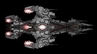 Naming still necessary, otherwise I think it's largely done. Except for weapons of course.
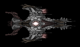
Unnamed Thing 02
Naming still necessary, otherwise I think it's largely done. Except for weapons of course.
Unnamed Thing 02
 See last post for notes
Posted: Fri Sep 18, 2009 2:46 am
by unsunghero10
Since it looks like (at least color wise) like a scar, how about the 'Cicatrix'?
Besides the triangle section in the wings, they look great.
Posted: Fri Sep 18, 2009 3:04 am
by Bad Boy
Personally I think you should scrap the wings and remake them. Their shape isn't very impressive, and the section use there is less then stellar. The front part of the wings (the dark grey area, the antennae and the glowy bit) doesn't look bad, so you could keep that, but the rest needs to go.
The rest of the ship is quite good, nice section use and shape, although the ass seems a little spindly where the tail connects.
Posted: Fri Sep 18, 2009 3:33 am
by Latooni
Manta. Needs more focus on curves, less focus on jaggy things.
Posted: Fri Sep 18, 2009 12:13 pm
by thanto_
The wings appear somewhat curved, whereas the rest of the ship is all angles and jaggies. So, they don't quite fit. I do think a manta-like design would be cool, so you could change the rest of the ship to fit more with the wings or vice versa. But as is, the wings just don't match.
Posted: Fri Sep 18, 2009 12:49 pm
by Silverware
the colors on this ship look like they need to modified slightly, the brownish red sections would look better in the same shade of brown as the other brown sections.
I like the wings but I do agree that they are slightly out of place when the rest of the ship is focused more in hard lines rather than curves.
Overall I do like it, but it could use some work.
Posted: Fri Sep 18, 2009 5:17 pm
by Silver Swordsman
Try tapering the wings out a bit--that should sharpen the look. Other else than that, I have no right to judge: this stuff is in the Anna Workshop thread for a reason.
Posted: Fri Sep 18, 2009 5:31 pm
by Anna
Silver Swordsman wrote:Try tapering the wings out a bit--that should sharpen the look. Other else than that, I have no right to judge: this stuff is in the Anna Workshop thread for a reason.
That's entirely false. Just because a person has earned the right to post ships here, does not mean their ships are above judgement or criticism. This applies even to me. Of course, the person in question may sometimes disagree with your criticism, but most of us do appreciate genuine criticism, and at least I try to use any I receive, if I think it's a good idea.
Posted: Fri Sep 18, 2009 5:38 pm
by Silver Swordsman
That's entirely false. Just because a person has earned the right to post ships here, does not mean their ships are above judgement or criticism. This applies even to me. Of course, the person in question may sometimes disagree with your criticism, but most of us do appreciate genuine criticism, and at least I try to use any I receive, if I think it's a good idea.
Oh, what I meant was by that was that there wasn't really anything for me to say about it--I was throughly impressed. There's no way I could do anything even remotely close to that (I'm pretty sure you would say so too), and to nit-pick someone else's faults... it just didn't seem right to me.
But thanks for clearing it up. My apologies for wording it wrong.
Posted: Fri Sep 18, 2009 7:25 pm
by Cycerin
I love the sepia colorscheme. However, the section choice does not really appeal to me. There's a lot of needless blurring and mix of hard/soft shapes that make the ship much less impressive when you start to pay attention to the details.
Posted: Fri Sep 18, 2009 10:23 pm
by ArcaneDude
So, in all, the main problems are the wings, the use of angular sections with the curved ones and (maybe) the colors. Allright, I'll redo or change those parts, and maybe fatten the connection between the hull and the engines a bit. I dunno 'bout the colors, I kinda like these...
Posted: Fri Sep 18, 2009 10:25 pm
by Silver Swordsman
I dunno 'bout the colors, I kinda like these...
Keep the colors. They show theme, which is better than taste.
Posted: Sun Sep 27, 2009 6:37 pm
by ArcaneDude
Two things:
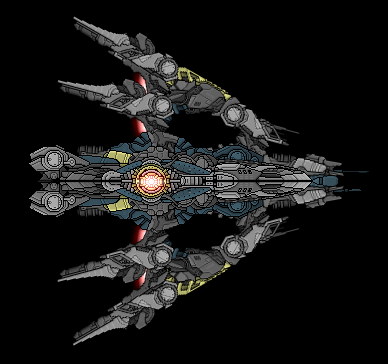
Did this a while ago, finally got around to posting it. Better now?
This one - let's call it Unnamed Thing 02 for now - popped up in my head while submitting my thing for the Chainship. I've already got some criticism, but I'd like a lot more. I really want this one to turn out good.
Posted: Sun Sep 27, 2009 6:52 pm
by Darkship
Criticism? Hmmmm
What I think is that the nose area is 'incomplete'. It could either be shortened so that it can flow more with the 'wings' or extended somehow. Personally I would go with shortening it because I think that making the nose longer would break the flow somewhat.
Nothing much other than that.
Posted: Sun Sep 27, 2009 10:43 pm
by Silver Swordsman
Agreed. Nose needs more juice. A lot more juice.