Page 1 of 1
Second. *now with more
Posted: Thu Sep 17, 2009 9:12 pm
by Room21
sup
you might remember my first thread, so anyway, all these new SW sections are pretty sick and all and I decided to try my hand at making a ship.

Posted: Thu Sep 17, 2009 10:09 pm
by Cycerin
This is pretty good overall. I like the front cause I love those smooth plating-over-substructure sections, but I think the section choice is somewhat jumbled overall. Needs more distinct depthing and a pass of color and all that crud. hull shape's also kinda plain.
oh & use f9 when getting screenshots and take them at 100% zoom for max crispness.
Posted: Thu Sep 17, 2009 10:09 pm
by goduranus
looking good, those sparks in the forward cannon(?) make it look really really evil.
Posted: Thu Sep 17, 2009 10:15 pm
by Room21
Thanks guys,
@goduranus
Thanks, and yea, the whole divide in the forward structure is part of a cannon.
@Cycerin,
For same reason, whenever I take screenshots in shipmaker using F9, they come out blurred like that. and it is at 100% zoom, any recommendations for colours?
Posted: Thu Sep 17, 2009 10:17 pm
by Cycerin
since you are just doing grey and some blue glows, a warm color like orange, or red? Remember that you can desaturate your color so your ship doesn't have to look like it's made of LEGOs.
Posted: Thu Sep 17, 2009 10:38 pm
by Room21
Posted: Fri Sep 18, 2009 12:05 am
by Kiltric
Much better. This really gives it some life, and it looks good against the glows and doodads.
Posted: Fri Sep 18, 2009 12:52 pm
by Room21
http://i153.photobucket.com/albums/s233 ... efton2.png
Changed around some parts, took out some of the more blocky sections.
Any thoughts, comments and criticism is much appreciated!
Posted: Sat Sep 19, 2009 5:55 pm
by Room21
update!
new, tiny fighter
Posted: Sat Sep 19, 2009 9:09 pm
by unsunghero10
[img]would%20make%20this%20more%20interesting,%20and%20get%20you%20more%20c&c.[/img]
Also, F11 when you take the shot.
Posted: Sun Sep 20, 2009 3:03 am
by Anna
Also, use F9. Then you can just click and drag and it automatically screenshots the area and saves it as a .png. It's handier and looks less ugly. And hit "Home" to set it to default zoom as well... there's no reason to zoom in that far.
The fighter thing looks okay. I don't like the other ship much at all, but am presently too tired to offer a proper critiquing. I'll be back to do that later.
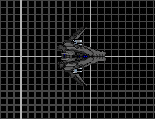
Posted: Sun Sep 20, 2009 11:57 am
by Room21
dual cockpit gunship I suppose.
not entirely finished, back needs work, as always, any C&C appreciated.
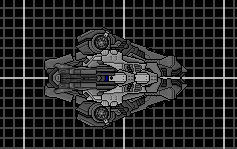
Posted: Sun Sep 20, 2009 6:20 pm
by TheShipwrightArms
It's a decent little ship, albeit extremely grey. The rear end looks unfinished, I would probably add some angled thrusters partially beneath the side cowling, possibly break up the slightly blancmangey back end with something along the spine.
Also the off centre 'cockpits' bug the hell out of me.
Your first ship reminds me of a deformed Kronosaur. There is not much in the way of a coherent shape to the latter half and the Kronosaur head looks overextended. Section use while not untidy as such, again lacks coherency.