Archives for ships and fleets. 'nuff said. Most of the ships here are very very old and will not work in current versions of BSF or SM. You have been warned!
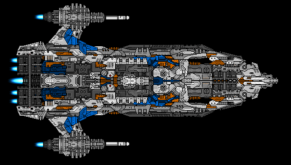
Hmm, pretty nicely industrial, without the blue and random nacelles. The tri-stepped outline made me think of the human halo ships a little. You've managed to blend that large square component into the engine block well - I normally hate seeing it, heh.
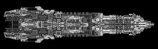
Other than that, it is a fairly generic block of a ship. Not that that's a particularly bad thing, just that its form isn't going to win any creativity prizes. Better than its previous iterations by far though, so well done on the improvement side of things, for all its blandness.
Lookin' much better, but there's one thing that still bugs me a bit. It's something some people do a fair bit. Right angles, man. Y'know what right angles are? They're boring and ugly. I'd say try to keep them to a minimum when you can.
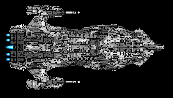
Also, since you're unsure of how to expand upon this, I thought I'd give you some ideas.
By no means to I expect you to use this if you don't want to, it's just to give you some ideas. That's kinda where I'd go with it, anyway. The blue lines are the recommended way to possibly expand it, the red lines highlight the right angles, which I feel are a little excessive.
Founder and Event Coordinator for the BSF Beauty Pageant. Founder of the Pseudo-Chainship Project. Admin. Games Master. Quality Control Enforcer
Gay cute girl and fucking proud of it.
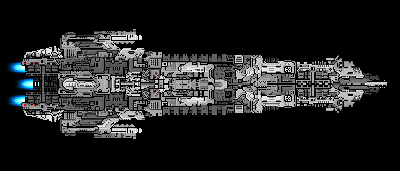
Hm. Not quite what I was envisioning, but not bad. I think the side-pods need a little work, but over-all you're improving at a pretty steady pace. Maybe try adding some colour now?
Founder and Event Coordinator for the BSF Beauty Pageant. Founder of the Pseudo-Chainship Project. Admin. Games Master. Quality Control Enforcer
Gay cute girl and fucking proud of it.
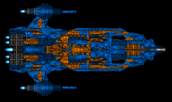
It's better than the last one. I'd say the blue on the wings, mostly just what's actually on the edge of the ship, looks out of place.
Also, in the rear, the white sections on top of the dark blue look funny. The colors make the depthing look odd, especially over the dark gray aft of that. It kinda gives the impression your ship has an asshole if you'll pardon the expression.
Keep in mind that in real life (yes I know this is BSF and real life is irrelevant, but anyway...) colors on ships come from paint people put on them, so try to put the colors on in such a way that it looks like they were painted.
In real life, any ship that saw anything close to 'extended service' would have a bleached look to it, depending on how close it got to stars, how many asteroid belts it skimmed by, or how long range its last battle was (debris, laser scaring, etc.).
Unless it's right off the dry dock, then I presume it would have the government's colors adorning it. I.E. a Nazi one would emphasize red.
What kind of government has orange and blue as their colors?
EDIT: Not to overshadow parameciumkid's post. I'm just adding my 20c to it.
@Masluk:
The newest version is certainly an improvement over the previous ones. In addition to everything the others have said, I think the area connecting the sidepods (And the sidepods in general) to the rest of the ship could use some additional work.
I personally think the color scheme is fine as it is.
@PK and Unsunghero:
In real life, space-born warships don't exist (yet).
To quote Squishy's sig "Realism, seriously? It's a space ship game. Realism was thrown out the window a long time ago."
unsunghero10 wrote:I.E. a Nazi one would emphasize red.
What kind of government has orange and blue as their colors?
Actually Ukranian flag is blue and yellow. Just remembered that a moment ago. And it was blue and orange until 1949. Bah, i'm no ukranian, so why should I say that? O_o


