Yes, another "Newbie ship" theme.

Archives for ships and fleets. 'nuff said. Most of the ships here are very very old and will not work in current versions of BSF or SM. You have been warned!

Moderators: th15, Moderators

Masluk
Lieutenant
Lieutenant
Posts: 34
Joined: Sat Aug 29, 2009 3:54 am

Post by Masluk »

something like this?
Image
Also i don't know why, but when i outfitted it with META stats weapons it was able to fight on par with Alliance cruisers. Two of them thrashed Sekhmet-class cruisers with ease. Is it overpowered?
th15
Administrator
Posts: 947
Joined: Sun May 13, 2007 12:01 am

Post by th15 »

Is that a truly giant quad blaster on the first ship?
Sean 'th15' Chan
[img]http://img63.imageshack.us/img63/6344/bfbanner2vy5.gif[/img]
Danny420Dale
Vice Admiral
Vice Admiral
Posts: 1344
Joined: Sat Sep 22, 2007 2:28 pm

Post by Danny420Dale »

th15 wrote:Is that a truly giant quad blaster on the first ship?
I think it is. Holy shit, that would be so awesome!
Masluk
Lieutenant
Lieutenant
Posts: 34
Joined: Sat Aug 29, 2009 3:54 am

Post by Masluk »

Um. Well, when it was designed in the first place i thought of something like that. A huge blaster thing that shoots small suns. But at the moment it is just a big plasma generator for a ship. with a big beam emitter of course. :)

By the way another atrocity coming right up!
Image

It is big and strange. And yes. The colorscheme sucks right now.
25000st
Captain
Captain
Posts: 493
Joined: Mon May 11, 2009 5:05 am

Post by 25000st »

Hmm... Not the most consistent ship but I'd say it looks ok. It could me more coherent and perhaps a bit less repetitive?
Masluk
Lieutenant
Lieutenant
Posts: 34
Joined: Sat Aug 29, 2009 3:54 am

Post by Masluk »

Yeah, I know. I had a headache when i was building it. I will remove most of its blue parts. I wanted to build a battleship, but somehow it became this. I don't want to start it from scratch because grey and white parts look more or less consistent to me. :)
Masluk
Lieutenant
Lieutenant
Posts: 34
Joined: Sat Aug 29, 2009 3:54 am

Post by Masluk »

Oh hai... I made a ship. *sigh* Somehow it turned out to be an USS Penisbrick!
Image
v_v *sigh*
C&C please? Yes, I know that design sucks, but I wanna know if my section usage improved or not.
jwa8402
Admiral
Admiral
Posts: 1988
Joined: Tue Feb 26, 2008 9:09 am

Post by jwa8402 »

Hmm, I think it really needs a habitation bubble on either side at the back :lol:
Seriously though, your sectionwork certainly isn't sloppy. You obviously put some thought into where you put each section, but now try concentrating more on making the overall design interesting and functional.

Only things I would say right away is that I don't like th3 pieces you used for the nose, give it more of a hammerhead feel perhaps? Something interesting...

Theres also visible split line down the middle that you might want to break up the way you did with the big square piece. Even weapon mounts will accomplish this nicely.

Maybe add some sort of projections off to the side in the middle. Not wings persay, but something to break up the...ridgedness of it.

Also, its rather hard for me to tell with the sw sprites, but did you give it any shading to simulate depth?
User avatar
Verminator
Captain
Captain
Posts: 390
Joined: Sat Apr 26, 2008 5:17 pm
Location: Warringtonia, Englandland

Post by Verminator »

I think changing the sections at the very front and adding something interesting on to the sides will make it look less like horse cock.
I have to kill fast and bullets are [i]too slow.[/i]
zackfire
Lieutenant
Lieutenant
Posts: 42
Joined: Wed Aug 05, 2009 10:20 am

Post by zackfire »

Perhaps try to make the ship stand out without the little glowy plasma balls on all of your ships? They needn't be stuck onto every ship you make.
Masluk
Lieutenant
Lieutenant
Posts: 34
Joined: Sat Aug 29, 2009 3:54 am

Post by Masluk »

Which one is better?

This one?
Image

Or this one?
Image

Or do they both suck?
User avatar
Anna
The artist formerly known as SilverWingedSeraph
Posts: 3447
Joined: Wed Sep 26, 2007 8:51 pm
Location: Elsewhere

Post by Anna »

They both suck.

You asked.
Founder and Event Coordinator for the BSF Beauty Pageant. Founder of the Pseudo-Chainship Project. Admin. Games Master.
Quality Control Enforcer
Gay cute girl and fucking proud of it.
Masluk
Lieutenant
Lieutenant
Posts: 34
Joined: Sat Aug 29, 2009 3:54 am

Post by Masluk »

Where exactly? Color scheme, form, design? Explain it.
EriErin
Commander
Commander
Posts: 129
Joined: Sun Oct 19, 2008 2:57 am
Location: Selangor, Malaysia

Post by EriErin »

Anna wrote:They both suck.

You asked.
You could've at least told him why. Jesus, I didn't expect you to stoop to the level of unconstructive one-liners.

@Masluk: The section usage you've got going in the middle of the ship is decent, but you need to try making the shapes of the nacelles and the engine block more flush with the ship. Currently, the nacelles don't look like they belong there. Change their shapes to something that matches more with a penisbrick hullform.

If you don't know where to start, I'd suggest ripping off the Battlestar Galactica's nacelles for this one.
[quote="Anna"]Roses are red,
Violets are blue,
I'll fuck you with a rake.[/quote]
User avatar
Anna
The artist formerly known as SilverWingedSeraph
Posts: 3447
Joined: Wed Sep 26, 2007 8:51 pm
Location: Elsewhere

Post by Anna »

EriErin wrote:You could've at least told him why. Jesus, I didn't expect you to stoop to the level of unconstructive one-liners.
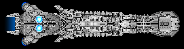
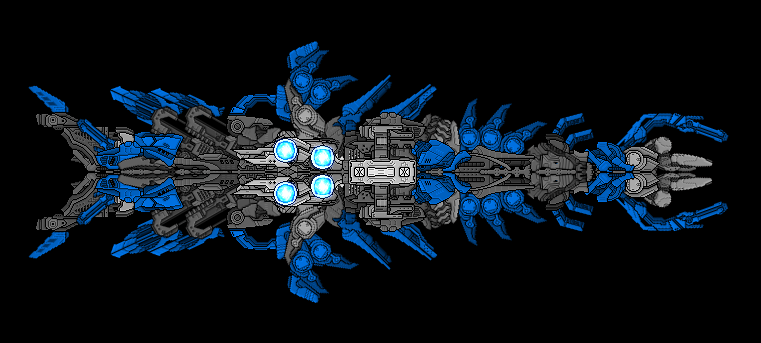
Where the hell do I fucking start? There's less good than there is bad on these ugly piles of excrement. The very middle core bits are pretty much the closest thing on the ship to good, but they're flat, bland and repetitive. The nose is... actually, the nose isn't bad. The rest of the ship is covered in way too big sections that are completely lacking in any detail. See those big, flat, boring sections? Don't fucking use them. Not unless you're making a really big ship and use them to fill space or for large armor plates or some shit. They don't look good. They don't look even a little bit good. They look like crap.

The blue is... too blue, in my opinion too. But that might just be me.

Happy? Or do I need to draw him a fucking manual? I'm sick of explaining this shit. It's tiresome and nobody fucking learns.

Pro-tips, new kid: 1) Internal shape and flow is just as important, if not even more important, than external shape and flow. 2) Details are good. I mean, you don't want to abuse the shit out of them, but if you can add detail without messing things up, you should do it. 3) Stop with the glowy plasma balls. You're not doing them right and so they look like ass. Learn to make a good ship without glowy bits before trying to use them.
Founder and Event Coordinator for the BSF Beauty Pageant. Founder of the Pseudo-Chainship Project. Admin. Games Master.
Quality Control Enforcer
Gay cute girl and fucking proud of it.
Locked