Archives for ships and fleets. 'nuff said. Most of the ships here are very very old and will not work in current versions of BSF or SM. You have been warned!
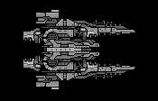
Personally, I think something needs to be done with the prongs at the front of the ship. They look a little out of place compared to the rest of it. Maybe close it off the same way you did with the Leechmonger.. Otherwise I don't think it looks cluttered at all.
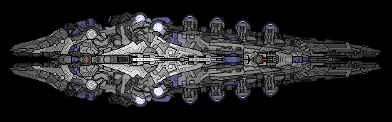
Let me start off by saying that I absolutely LOVE your latest work due to the sense of depth and the color scheme. The changes on the Ostarava make it fit in with the rest of the fleet much more easily. Also, if the cruiser is meant to be in the same fleet then I feel that it lacks the depth and angularity that defines the others. Otherwise, my only comment on it would be that the back looks a bit flimsy.
All points put forward are simply my opinion. Looking forward to seeing more of your work.
The Orstarva is simply beautiful... The gray gradient is marvelous, and the whole ships is cluttered enough for sensible complexity, but not cluttered enough to become a jumbled mix. The purple highlights fit in very well. You sir, have some talent.
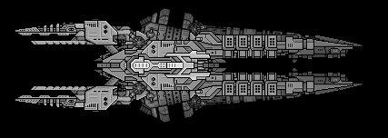
The missile cruiser seems flimsy on the back end, and a bit boring. Give it the layering smexyness like on the Orstarva?
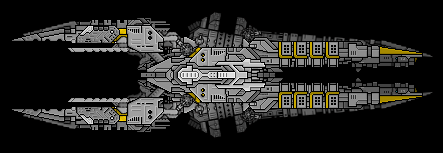
Here is another cruiser based off of my "spikey peanut" style. To be honest I don't really like it, in fact I loathe it... Everything about it just really bugs me.
I would also like to add that this ship will be my last in this style.
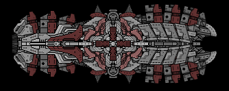
Here is also another small ship that I dubbed as the Ashcroft.
The ashcroft's core is a bit too blocky. The spiky peanut is a pretty cool ship, although It isn't as good as the previous ones. I like the new missile cruiser, with the gold outline lending itself well.
It's not my fault I can't take your post seriously.