
I normally like ships with gray in them for a few reasons.
-It normally looks better.
-I think it is more realistic.
-And the answer to your first question. It makes adding weapons without re-coloring a lot easier.
If you don't want to add gray, however, putting weapons under sections and on top of circular sections often is the solution.
BlackMetalZivon's Ships
Moderators: th15, Moderators
King Tiger is much better, though the colors are still a little harsh, consider "greying" them down a bit.
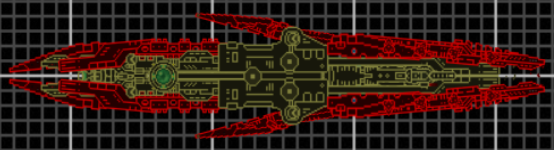
Panzer looks improved, but your section usage is still sloppy and haphazard, especially in the rear. You seem to have the idea of flow better in King Tiger, take a few notes from there and try to apply them to Panzer's sections. That goes for the weapons as well, might help make them look better.
Panzer looks improved, but your section usage is still sloppy and haphazard, especially in the rear. You seem to have the idea of flow better in King Tiger, take a few notes from there and try to apply them to Panzer's sections. That goes for the weapons as well, might help make them look better.
-
Imperator Pavel I
- BANNED
- Posts: 74
- Joined: Sun May 03, 2009 3:03 am
-
BlackMetalZivon

- Lieutenant

- Posts: 33
- Joined: Sun Jun 07, 2009 3:30 pm
-
ArcaneDude
- Fleet Admiral

- Posts: 2520
- Joined: Sun Jan 27, 2008 4:50 am
- Location: Antwerp, Belgium
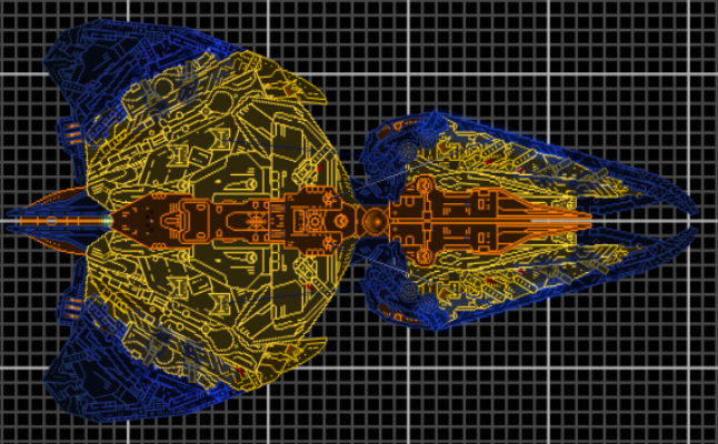
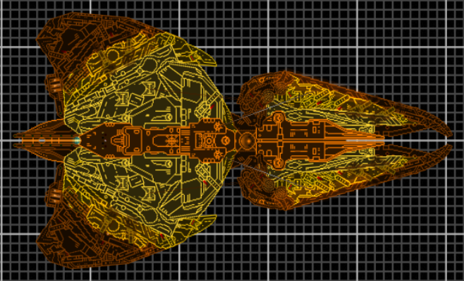
The Panzer still looks horrible, the newer version is not an improvement. It suffers from the exact same flaws as the previous version. Are you even listening to what people say?
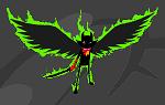
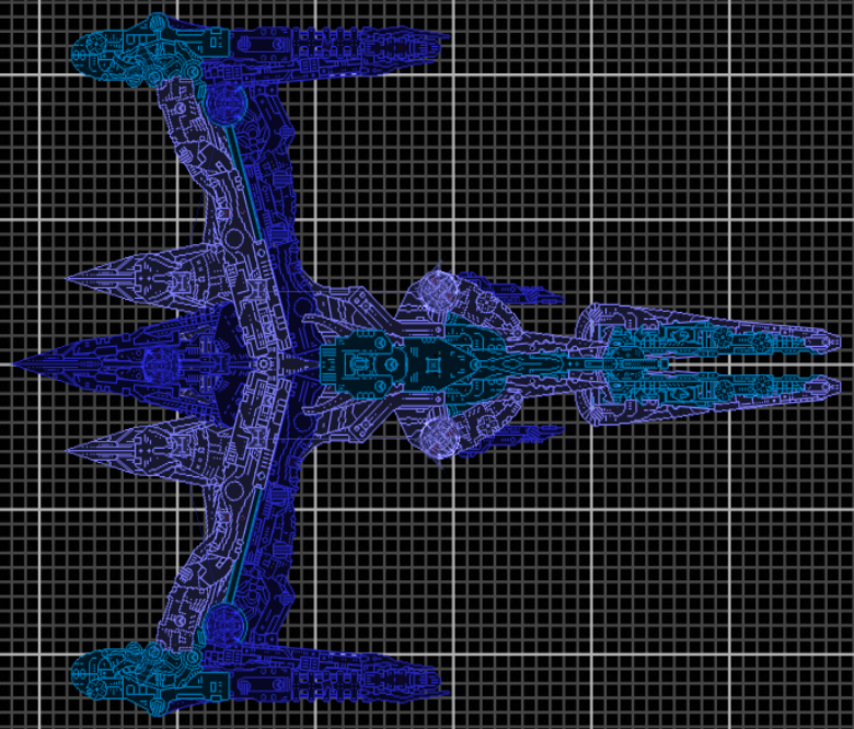
The King Tiger is flimsy, the wings look like they'll spontaneously fall off. The shape is okay, but try to alter the proportions so that it's sturdier. Section usage also needs a vast improvement. Colors are okay, and for once the recoloured weapons don't seem that much of an eyesore.
The King Tiger is flimsy, the wings look like they'll spontaneously fall off. The shape is okay, but try to alter the proportions so that it's sturdier. Section usage also needs a vast improvement. Colors are okay, and for once the recoloured weapons don't seem that much of an eyesore.
Check out The Star Wreck project!
Check out the Epic Music Library
And in this Alliance we bestow our hope and will, that the Dogs of War may never harass the people of our homes again, and that it will bring peace, equality and liberty for all in need and despair. One Universe, One Goal. By the Manifest we command this.~ Saren Vil Ush
-
Anna
- The artist formerly known as SilverWingedSeraph
- Posts: 3447
- Joined: Wed Sep 26, 2007 8:51 pm
- Location: Elsewhere
Do me a favour, DarkmetalZivon. Before taking screenshots, press "home" to go to default zoom. Do not zoom in more than this unless the ship is so tiny it would be otherwise invisible. You especially don't zoom in so much that the fucking screenshots stretch the forum frames.
If I see you doing it any more, I'll give you a warning for every picture that's too large.
If I see you doing it any more, I'll give you a warning for every picture that's too large.
Founder and Event Coordinator for the BSF Beauty Pageant. Founder of the Pseudo-Chainship Project. Admin. Games Master.
Quality Control Enforcer
Gay cute girl and fucking proud of it.
Quality Control Enforcer
Gay cute girl and fucking proud of it.
-
BlackMetalZivon
- Lieutenant
- Posts: 33
- Joined: Sun Jun 07, 2009 3:30 pm
Yes I'm listening. I'm already reworking the Panzer's design.ArcaneDude wrote:The Panzer still looks horrible, the newer version is not an improvement. It suffers from the exact same flaws as the previous version. Are you even listening to what people say?
The King Tiger is flimsy, the wings look like they'll spontaneously fall off. The shape is okay, but try to alter the proportions so that it's sturdier. Section usage also needs a vast improvement. Colors are okay, and for once the recoloured weapons don't seem that much of an eyesore.
It already occured to me that the King Tiger looks flimsy.
-
BlackMetalZivon
- Lieutenant
- Posts: 33
- Joined: Sun Jun 07, 2009 3:30 pm
-
Anna
- The artist formerly known as SilverWingedSeraph
- Posts: 3447
- Joined: Wed Sep 26, 2007 8:51 pm
- Location: Elsewhere
I notice you completely ignored my advice and zoomed in ridiculous amounts, so your ships look all fuzzy and blurry and nasty. Luckily for you, you didn't make them so big that they stretch the forum frames, so all I can do is frown and shake my head disapprovingly.
The Panzer is goddamn hideous, by the way. What on earth made you think that was an attractive colour scheme? There are alternatives other than "PURE DARK BLUE" and "PURE BRIGHT YELLOW". There are happy mediums that don't look so eyebleedingly nasty. For fuck's sake.
The Panzer is goddamn hideous, by the way. What on earth made you think that was an attractive colour scheme? There are alternatives other than "PURE DARK BLUE" and "PURE BRIGHT YELLOW". There are happy mediums that don't look so eyebleedingly nasty. For fuck's sake.
Founder and Event Coordinator for the BSF Beauty Pageant. Founder of the Pseudo-Chainship Project. Admin. Games Master.
Quality Control Enforcer
Gay cute girl and fucking proud of it.
Quality Control Enforcer
Gay cute girl and fucking proud of it.

-
BlackMetalZivon
- Lieutenant
- Posts: 33
- Joined: Sun Jun 07, 2009 3:30 pm
You're totally missing the point. Don't. Zoom. In. At. All. As soon as you zoom, it gets fuzzy. If it's fuzzy at standard zoom, then you've been stretching sections which is, generally speaking, not a good practice now that custom sections are supported. As far as the ships themselves, they range from mediocre to ugly. Not as bad as some of the stuff around here, but not great by any stretch of the imagination. There are numerous things you could pick up by taking a look at some of the better-received works around the forum. AD, Anna, Eri, etc. are all good places to start.BlackMetalZivon wrote:I zoomed in no more than one or two clicks from default zoom for the most recent screenshots.