AD's cunning concepts: Adelaide class on page 11.
Moderators: th15, Moderators
-
ArcaneDude
- Fleet Admiral

- Posts: 2520
- Joined: Sun Jan 27, 2008 4:50 am
- Location: Antwerp, Belgium
An inbetween concept, probably for an adversary to the Verdians. Note that the final product may be substantially different as some parts just feel...wrong in a way. Can't put my finger on it. Any comments would be highly appreciated.
Adelaide class Ship of the Line
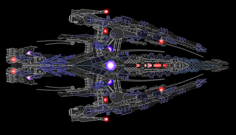
Credits to cycerin for his Archaedas colorscheme, and a bunch of his sections of course.
EDIT: changed the engine, ass went from fat to skeletal to fit better with the rest of the ship.
Adelaide class Ship of the Line
Credits to cycerin for his Archaedas colorscheme, and a bunch of his sections of course.
EDIT: changed the engine, ass went from fat to skeletal to fit better with the rest of the ship.
Check out The Star Wreck project!
Check out the Epic Music Library
And in this Alliance we bestow our hope and will, that the Dogs of War may never harass the people of our homes again, and that it will bring peace, equality and liberty for all in need and despair. One Universe, One Goal. By the Manifest we command this.~ Saren Vil Ush

Do not agree. I'm still not keen on mixing in those WF, low detail sprites, but I'm starting to get used to it. The glows are excellent. I have to admit that I liked earlier incarnations of this style better, particularly color scheme, but this is still kickass. Definitely much more refined.25000st wrote:No offense but the section usage is really bad in some places.
-
Corporal Jomn

- Captain

- Posts: 355
- Joined: Sat Jun 27, 2009 10:06 am
- Location: A place, somewhere
Really great ship AD! The DooBlinker/DooBlinkFader on the WF_Sec02 on the wings kinda seem to be out of place. But that's in the opinion of a lowly Lieutenant in the face of a Grand Admiral, who has gold!
A gay as fuck girl and loving it.
████████████████████
████████████████████
████████████████████
████████████████████
████████████████████
████████████████████
████████████████████
████████████████████
-
ArcaneDude
- Fleet Admiral
- Posts: 2520
- Joined: Sun Jan 27, 2008 4:50 am
- Location: Antwerp, Belgium
I will listen to you in this case only if you can actually point out where. Largely because I don't know where this section usage could be called 'really bad'. It does need some cleanup here and there though, I'll give ya that.section usage is really bad in some places.
Check out The Star Wreck project!
Check out the Epic Music Library
And in this Alliance we bestow our hope and will, that the Dogs of War may never harass the people of our homes again, and that it will bring peace, equality and liberty for all in need and despair. One Universe, One Goal. By the Manifest we command this.~ Saren Vil Ush
Check out the Epic Music Library
And in this Alliance we bestow our hope and will, that the Dogs of War may never harass the people of our homes again, and that it will bring peace, equality and liberty for all in need and despair. One Universe, One Goal. By the Manifest we command this.~ Saren Vil Ush
-
ArcaneDude
- Fleet Admiral
- Posts: 2520
- Joined: Sun Jan 27, 2008 4:50 am
- Location: Antwerp, Belgium
Bump
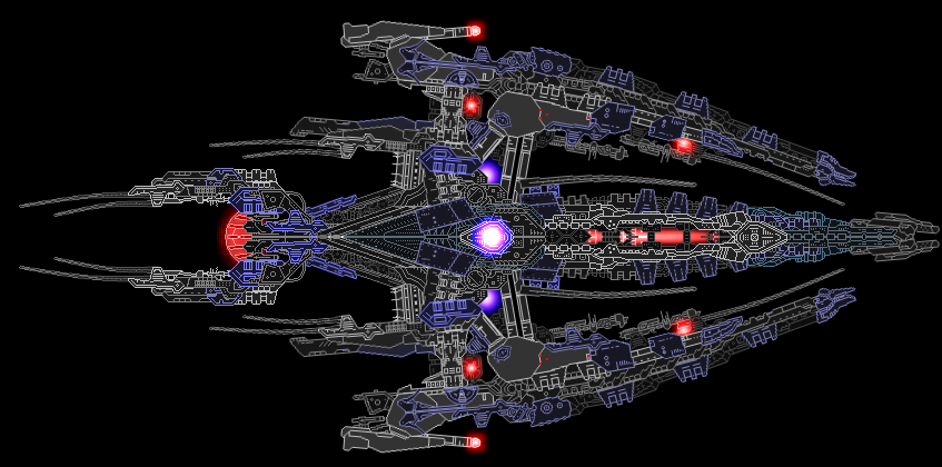
Finished product:
Imperium of Man Adelaide class Ship of the Line
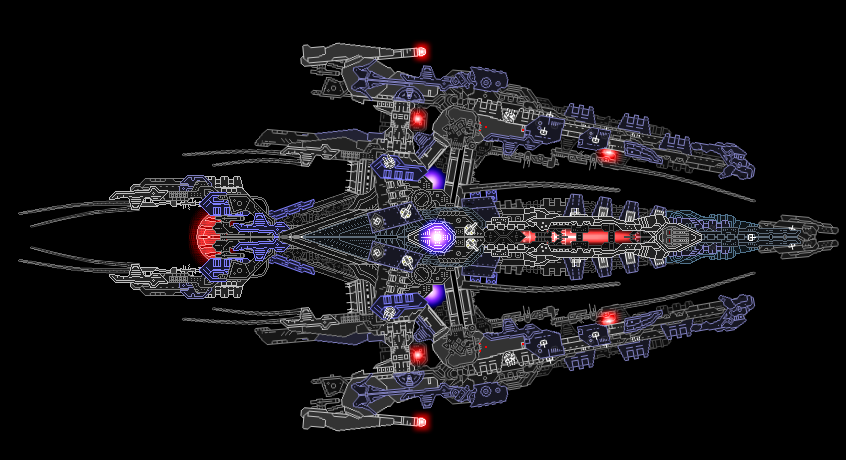
Armament:
21 35mm Anti-Projectile Flak Batteries
12 50mm Dual Anti-Fighter Shrapnel Flak Batteries
4 120mm Anti-Ship Long Range Flak Batteries
1x Quad Tactical Nuclear Charge Battery (One vessel carries 1.500 Nuclear Warheads, each counting 75 Megatonnes of explosive force)
1x "Ragnarok" 180 MW Focused Fusion Lance
6x "Rampage" Swarm Missile Launchers (One vessel carries 2.000 missiles, each counting 60 Megatonnes of explosive force)
Still looking for more feedback, though.
Finished product:
Imperium of Man Adelaide class Ship of the Line
Armament:
21 35mm Anti-Projectile Flak Batteries
12 50mm Dual Anti-Fighter Shrapnel Flak Batteries
4 120mm Anti-Ship Long Range Flak Batteries
1x Quad Tactical Nuclear Charge Battery (One vessel carries 1.500 Nuclear Warheads, each counting 75 Megatonnes of explosive force)
1x "Ragnarok" 180 MW Focused Fusion Lance
6x "Rampage" Swarm Missile Launchers (One vessel carries 2.000 missiles, each counting 60 Megatonnes of explosive force)
Still looking for more feedback, though.
Check out The Star Wreck project!
Check out the Epic Music Library
And in this Alliance we bestow our hope and will, that the Dogs of War may never harass the people of our homes again, and that it will bring peace, equality and liberty for all in need and despair. One Universe, One Goal. By the Manifest we command this.~ Saren Vil Ush
Check out the Epic Music Library
And in this Alliance we bestow our hope and will, that the Dogs of War may never harass the people of our homes again, and that it will bring peace, equality and liberty for all in need and despair. One Universe, One Goal. By the Manifest we command this.~ Saren Vil Ush

-
ArcaneDude
- Fleet Admiral
- Posts: 2520
- Joined: Sun Jan 27, 2008 4:50 am
- Location: Antwerp, Belgium
Well, unless you can tell me *what's* missing and *why* it's not epic enough, I...really can't do shit with that comment.
Check out The Star Wreck project!
Check out the Epic Music Library
And in this Alliance we bestow our hope and will, that the Dogs of War may never harass the people of our homes again, and that it will bring peace, equality and liberty for all in need and despair. One Universe, One Goal. By the Manifest we command this.~ Saren Vil Ush
Check out the Epic Music Library
And in this Alliance we bestow our hope and will, that the Dogs of War may never harass the people of our homes again, and that it will bring peace, equality and liberty for all in need and despair. One Universe, One Goal. By the Manifest we command this.~ Saren Vil Ush
it's just my opinion, but i think you should trash the spindly things, or atleast make them shorter and fatter. i don't care for the colors, but it still looks good.
edit: aslo, i think the engine would look better if it were close to the rest of the ship.
edit: aslo, i think the engine would look better if it were close to the rest of the ship.
Last edited by Xynus on Fri Jul 10, 2009 3:42 am, edited 1 time in total.
The ship seems cluttered to me. I haven't seen that from you before. Those red doodads also look off. The rear bulb engine and parts around it look like they would fall off. Perhaps make less of a slant with the sections connecting the engine and the main part of the ship? (I hope you understand what I just wrote because it's hard to understand.) I really like your lighting effects though. Also, where'd you get those Cycerin sections? Is there another place to get sections other than the 'Custom Content'?