My first ship!! [UPDATED!!]
Posted: Sun Feb 08, 2009 4:17 pm
Well i got bored some i made a ship. Comment and rate it and suggest new improvements. I can take criticism too as long as its not too offensive.
Mygonian Arius Anti-Capital Ship
The Arius is designed to quickly and efficiently destroy large capital ships.
It is armed with ballistics based weaponry with an some extra lasers:
1 High Intensity Plasma Cannon
1 Photonic Laser Array
2 Torpedo Launchers
2 Quantum Lasers
1 MiniMissile Pod
2 Blaster Cannons
It also has a special MagnoField which allows some outer sections to be saved if an inner section is destroyed.
Here are the pictures from the first test of the Arius against Spoot Knight's SIBs-68 Templar class Battleship:
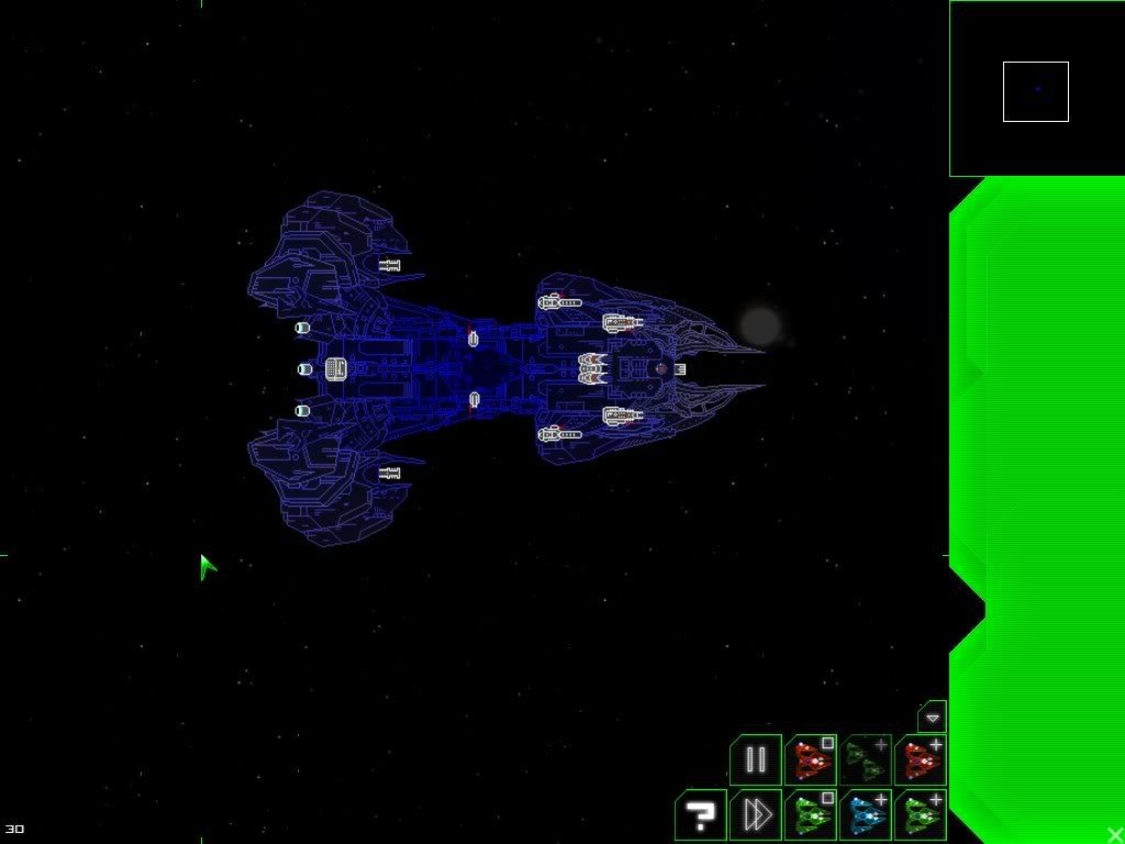
The ships are set up:

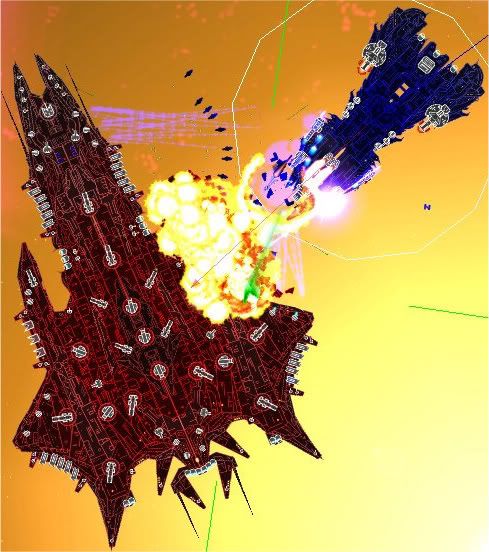
The shooting commences:
And the Arius has annihilated its first capital ship:
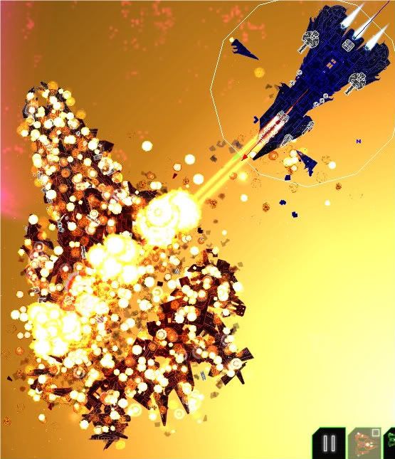
Please note the laser is not that powerful, it was scaled up for the demonstration.
Its weakness is its rear which is defended by a rather weak missile pod.
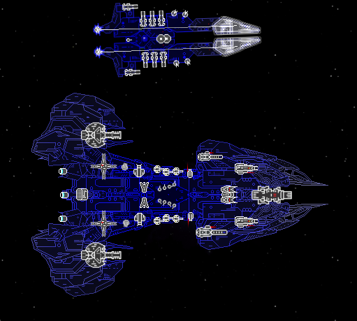
Now the Arius compared to a normal Athena:
Download it here: http://www.wyrdysm.com/battleshipsforev ... ruiser.shp
Credits to:
Me - for making this ship
Spoot Knight - for making the Templar
Sean "th15" Chan - for making BF
Please also tell me if you think I should make a fleet out of this.
Also if your gonna say you think this ship is uber overpowered it is meant to take on the biggest ships in any fleet and it has to be very strong.
Updates: I added some new guns and moved the TacNukes a bit. I also redesigned most of the inner body and the nose with some new sections I found.
More Updates: Hid the main guns under the hull and removed some of the weaponry. Colour scheme still to come
More Updates: I tuned down the weapons and made the speed and turning really slow to compensate for front laser.
Mygonian Arius Anti-Capital Ship
The Arius is designed to quickly and efficiently destroy large capital ships.
It is armed with ballistics based weaponry with an some extra lasers:
1 High Intensity Plasma Cannon
1 Photonic Laser Array
2 Torpedo Launchers
2 Quantum Lasers
1 MiniMissile Pod
2 Blaster Cannons
It also has a special MagnoField which allows some outer sections to be saved if an inner section is destroyed.
Here are the pictures from the first test of the Arius against Spoot Knight's SIBs-68 Templar class Battleship:
The ships are set up:
The shooting commences:
And the Arius has annihilated its first capital ship:
Please note the laser is not that powerful, it was scaled up for the demonstration.
Its weakness is its rear which is defended by a rather weak missile pod.
Now the Arius compared to a normal Athena:
Download it here: http://www.wyrdysm.com/battleshipsforev ... ruiser.shp
Credits to:
Me - for making this ship
Spoot Knight - for making the Templar
Sean "th15" Chan - for making BF
Please also tell me if you think I should make a fleet out of this.
Also if your gonna say you think this ship is uber overpowered it is meant to take on the biggest ships in any fleet and it has to be very strong.
Updates: I added some new guns and moved the TacNukes a bit. I also redesigned most of the inner body and the nose with some new sections I found.
More Updates: Hid the main guns under the hull and removed some of the weaponry. Colour scheme still to come
More Updates: I tuned down the weapons and made the speed and turning really slow to compensate for front laser.