Archives for ships and fleets. 'nuff said. Most of the ships here are very very old and will not work in current versions of BSF or SM. You have been warned!
I've been playing around with the ship maker for a few weeks now, and I finally feel that I made some ships worth posting. I based these off of the ships from a table top game I designed, from the faction called the "Telmun Union". The game has two other factions, I will be making their ships after I get feedback from the first batch.
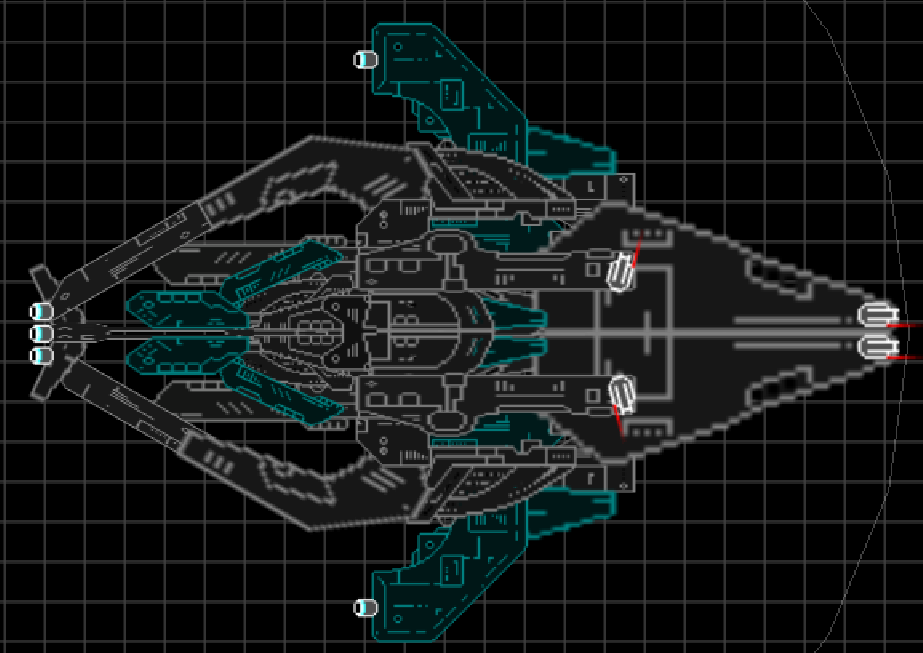
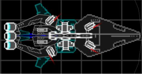
1.Telmun Union Navy Corvette:
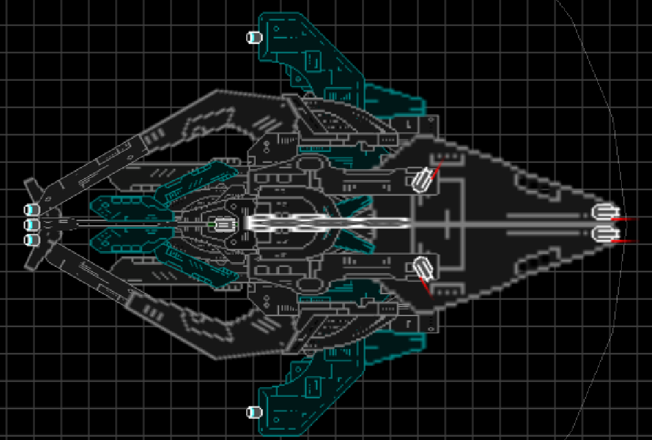
2.TUN Frigate:
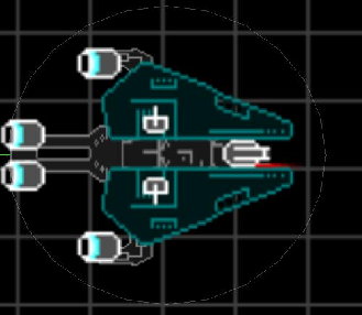
3.TUN Heavy Frigate
4.TUN Destroyer
5.TUN Cruiser
These ships aren't so bad. I'd suggest shrinking the weapons some more, or using less (four huge blasters on a small ship = eyeburn). Otherwise, pretty good for a starter.
Also, the forward triangular pieces (the two section 2's on each ship) overlap. You can use Shift+arrow keys to move them per pixel, if you want to fix the centerline.
Check out The Star Wreck project! Check out the Epic Music Library And in this Alliance we bestow our hope and will, that the Dogs of War may never harass the people of our homes again, and that it will bring peace, equality and liberty for all in need and despair. One Universe, One Goal. By the Manifest we command this.~ Saren Vil Ush
Yeah, I know the weapons need to be smaller. I kinda just want an opinion on the look and shape of the ships, then I'm going to try and remake them on a larger scale. Thanks for the tips!
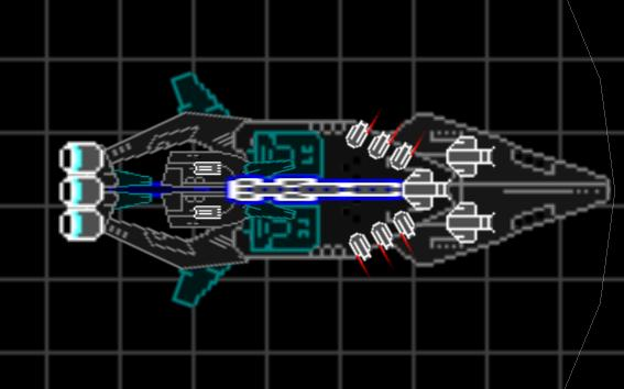
Well I remade everything in a larger scale, except the corvette. I tried remaking the corvette, but I couldn't get it to look right. I think they are great improvements.
Frigate:
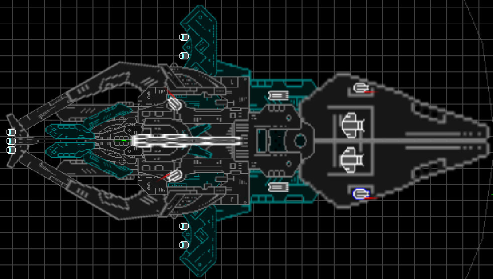
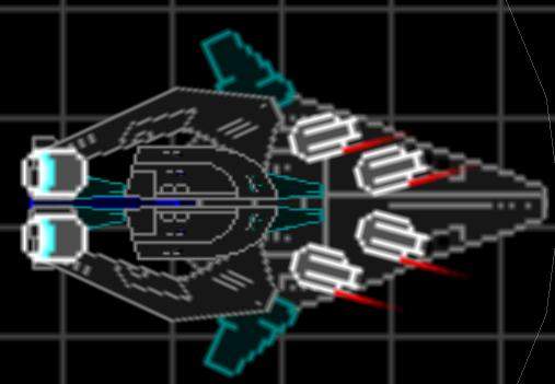
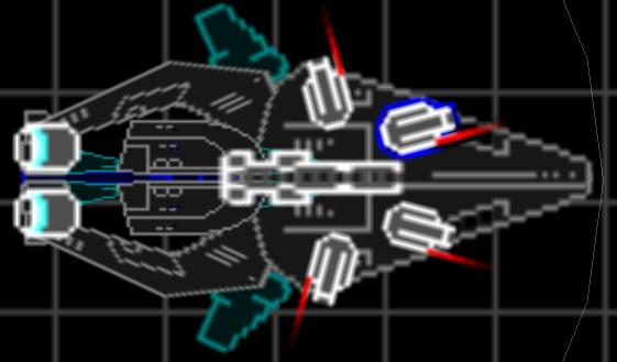
Heavy Frigate:
Destroyer:
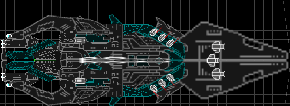
Cruiser:
If you can ever help it,avoid high stretching or bloating of sections.
The noses of the new ships are a perfect example of overbloat.
Try using normal or slightly stretched/bloated sections to draw out a shape,then fill any gaps with bulk sections(slight repetition is ok here).Then if applicable,add ablatives.
Also, it's preferred if you post screenshots at the default zoom level. Believe it or not it's easier to see things if they're not gigantic and in our face.
The stretched sections and weapons are awful. Everything looks horrible and pixellated.
Arcalane wrote:Also, it's preferred if you post screenshots at the default zoom level. Believe it or not it's easier to see things if they're not gigantic and in our face.
The stretched sections and weapons are awful. Everything looks horrible and pixellated.
Totally agreed, also there is a problem with the weapon mirroring on the back of the heavy frigate; there are 2 missile launchers not 1.
Try using the parenting lines to make them all strait.
People need to learn that stretched pieces used inappropriately (a good example would Bahamut and his 'Grand Cruiser') are horrible.
Usually stretch to fill in gaps, or add some nice features, not to use as whole section itself. It's ugly.
However (I said this numerous times), your design is good, but the way you implemented them were bad.


 People need to learn that stretched pieces used inappropriately (a good example would Bahamut and his 'Grand Cruiser') are horrible.