Page 1 of 1
Rather Big *updated*
Posted: Wed Feb 06, 2008 9:06 pm
by gompasta
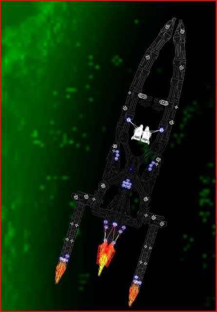
well i had fun making this and its still very unfinished

sorry for the bad image but its too big to get it better
Re: Rather Big
Posted: Wed Feb 06, 2008 9:35 pm
by Kaelis
gompasta wrote:sorry for the bad image but its too big to get it better
No, its not. Make a few screenshots of different parts of the ship and then combine them.
Another thing is that its too dark to see any kind of detail.
Posted: Wed Feb 06, 2008 10:14 pm
by Siber
Detail? I can hardly see the ship, let alone any detail, unless I squint hard. Maybe it looks better in the game with glow colors applied, but this screen just doesn't cut it. Change the colors and try again?
Posted: Wed Feb 06, 2008 10:31 pm
by Arcalane
That's the best you can do?

If the core, deflecs/etc. are all unmodified in size then that's pretty small.
Yeah, needs more colour so we can actually SEE it.
Posted: Wed Feb 06, 2008 11:28 pm
by Master Chief
Argh, my eyes! You're destroying my eyes!
Seriously, take ALL screenshots in-game unless people request parenting of the ships.
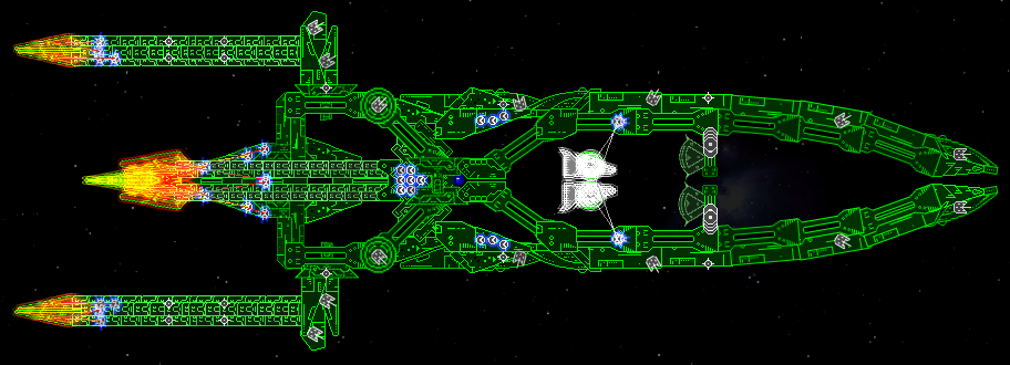
updated
Posted: Thu Feb 07, 2008 12:00 am
by gompasta

there better now?
and finished
Edit: removed the download link and will edit ships stats
Posted: Thu Feb 07, 2008 1:37 am
by Arcalane
Not better and definitely not finished. You didn't even bother to set the stats!

Bad tiling, bad repetition. Useless floaty aegis.
Posted: Thu Feb 07, 2008 1:41 am
by gompasta
oops
Posted: Thu Feb 07, 2008 5:52 am
by TormakSaber
The "Booster flames" at the end of the engines are pretty cool though.
Posted: Thu Feb 07, 2008 6:25 am
by Boba Fettuccini
but thats about it though

Posted: Thu Feb 07, 2008 6:55 am
by Arcalane
TormakSaber wrote:The "Booster flames" at the end of the engines are pretty cool though.
Recoloured aegis - not exactly a new concept as far as engine trails go.
Posted: Thu Feb 07, 2008 7:07 am
by TormakSaber
Just because something doesn't pioneer or innovate a new concept doesn't mean it can't look cool in its own right, though.
Posted: Thu Feb 07, 2008 8:15 am
by Zeybrin
I like it. . .
The cylinder/tube things could be better. . .but other than that I like the whole struts look.
Aye
Posted: Fri Feb 08, 2008 6:51 am
by Alunya
I like the boosters on the back...that ment to look like flames...maybe chahneg the colours a little bit
Posted: Fri Feb 08, 2008 7:45 pm
by Exethalion
I looked at the first image and thought 'wow, that ship skeleton looks awesome, this is gonna be a whoppa!'.
Then, well, all you did was stretch some bits and finito.
Conclusion: Waaay too much negative space, and those right angles are horrid. The core area is nice, but it really needs some fleshing out.


