
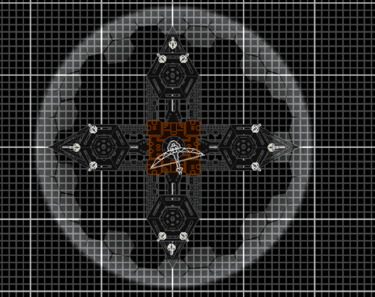
I placed the disks unevenly on purpose, I just didnt like the way EVERYTHING was so symmetrical so I mixed up the platforms a little .
And yes, the armor on the station itself is quite weak. But to get to it you have to break through the High HP shield. And I will change the size of said shield.
With that said.
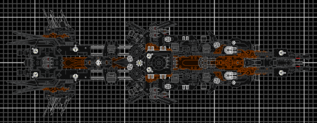
FlySwatter Class Anti-Fighter Frigate
-n/a-
Hammer Class Attack Frigate
-n/a-
Due to the similarity of the hull's on these two units, parts and weapons are easily interchangeable giving the two classes the ability to share plating, engine components, etc. And the downsizing of production facility's for maintaining the two classes.
G.D.F. Fleet -Terran Division-
Moderators: th15, Moderators


Aesthetics > "Real-Life" Functionality around these parts. And your disks are still floating. Matter cannot affix itself to an energy shield! When I said to attach them to the station, I meant the station itself! (Or just give them ThrusterEx's! It's not that hard to do!)
Also, minor nitpick: the shield should be the topmost section. The disks are not only separated from the station, they are above the outer protection? DESIGN FAIL. Just select the section and hold the A key for a couple seconds. It should look like it is covering the extra-dimensional (not affected by the laws of physics) disks.
Also, minor nitpick: the shield should be the topmost section. The disks are not only separated from the station, they are above the outer protection? DESIGN FAIL. Just select the section and hold the A key for a couple seconds. It should look like it is covering the extra-dimensional (not affected by the laws of physics) disks.
Ne me forcez pas à arracher votre gorge, s'il vous plaît.
~~~~~
[b]ZOMG NINJA SARCASM[/b] :shock:
~~~~~
[quote="Arcalane"]If anyone says "y'all" again I'm going to string them up and put their head on a pike.[/quote]
~~~~~
[b]ZOMG NINJA SARCASM[/b] :shock:
~~~~~
[quote="Arcalane"]If anyone says "y'all" again I'm going to string them up and put their head on a pike.[/quote]
Yeah, little mistake with the layers there. But disks are gone anyway, im gonna try something along those lines. So for now this is all it is.
-n/a-
But I re-did the plates on the hammer/flyswatter and I also depthed some of the main guns.
-n/a-
-n/a-
But I re-did the plates on the hammer/flyswatter and I also depthed some of the main guns.
-n/a-
Last edited by DAikum on Sat Apr 18, 2009 8:09 pm, edited 1 time in total.
I like the new station better than the older one, however I find it interesting that the top and bottom hexagon sections don't line up with the struts like the left and right hexagons do. They're too far to the left. And I say the Hammer/Flyswatter needs some more details or doodads on the ablative plating and the front nosepiece (the Tug sprite). Maybe some side-facing weaponry or PD guns?
Ne me forcez pas à arracher votre gorge, s'il vous plaît.
~~~~~
[b]ZOMG NINJA SARCASM[/b] :shock:
~~~~~
[quote="Arcalane"]If anyone says "y'all" again I'm going to string them up and put their head on a pike.[/quote]
~~~~~
[b]ZOMG NINJA SARCASM[/b] :shock:
~~~~~
[quote="Arcalane"]If anyone says "y'all" again I'm going to string them up and put their head on a pike.[/quote]
Hmmm weird ... anyway, fixed.
---------------------------------------
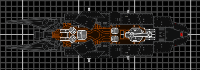
Hammer doodads and minor upgrades.
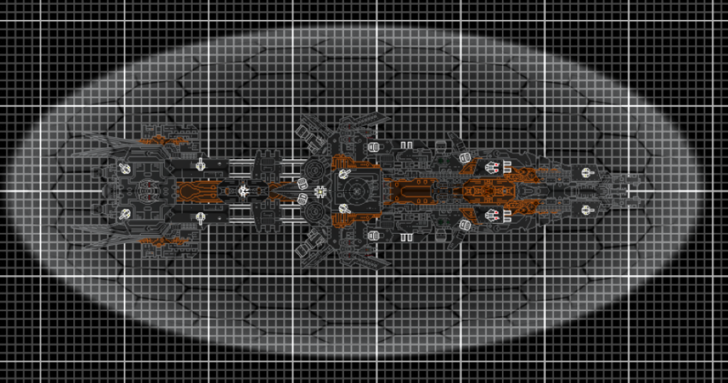
And my Beltora Class Battleship. Initially just something to fight my friends with, but I decided to clean it up and put it on here.
Each one of the thruster outlets contain a EX-thruster and when their all gone its simply a floating heap.
------------------------------------
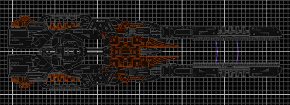
Also, Massive Vigilance Update.
---------------------------------------
Hammer doodads and minor upgrades.
And my Beltora Class Battleship. Initially just something to fight my friends with, but I decided to clean it up and put it on here.
Each one of the thruster outlets contain a EX-thruster and when their all gone its simply a floating heap.
------------------------------------
Also, Massive Vigilance Update.
Alright. These just aren't getting any better. For starters, the color scheme is plain terrible. You can use "realistic" colors without making it look like your ships are made of rusted out iron.
Next, you really need to work on your section choice. It's incredibly haphazard. The difference between a good ship and a bad one is, most of the time, section choice. Get a clear image in your head (or on paper), and then use sections to create that image. Don't let sections create the image for you.
Moving on, we have a very terrible application of bubble shields. Your most recent shielded ship, in fact, is hardly visible underneath that shield.
Individual criticism:
Station
I don't have much to complain about beyond the repetitaveness, color scheme, shield that adds nothing to its appearance, bizarre section choice, and that dumb radar dish that new builders seem to love so much. Actually, that's a pretty extensive list. Furthermore, the weapons are just sitting on the hull. With so many sections available and the ability to easily add more, there is no excuse to not build weapons into the hull in some way.
Next thing (Hammer?)
Color scheme still sucks. Armor segments are STILL incredibly repetitive. Different section schools are used in the back and the front, and the effect is not good. Armaments are questionable, at best. I spot multiple mirroring errors. This is probably my favorite of the four.
Beltora
I can't really comment on this because, aside from the basic shape, I can't see it. Armament seems considerably lighter than the much smaller Hammer, which is strange, to say the least.
Vigilance
Section usage is just awful. The shape is not good either. LOTS of open space (read: holes), which is terribly nonsensical, especially since you've stated before that you're going for realism. This goes for your other ships, too.
But the thing is I like that dark scheme with the dark orange/rust color. Its not for realism, its just for my personal preference.
Station- I personally like how even the station is. And there are actually quite a few weapons built into the hull of the ship, Twin Beamers and Mini missile pods. Also just curious, how is the section choice 'bizzare'?
Hammer- Its kinda hard (Atleast for what I can see) To use those plates in a non-repetitive manor. The armaments was kinda weird, I wanted another big gun but I didn't want to put on another Rail Cannon or use a beamer so I just stuck the Art cannon on.
Baltora- Weapons are there, just hidden in alot of places.
Without shield, and different because I keep on going back and tweaking/adding/changing things. Also weapons have been shone in a lighter color
Vigilance- The spaces are going to be filled, and nothing there is really set in stone and changes pretty much every hour. But yes, the holes will be filled.
-
maarten
- BANNED
- Posts: 417
- Joined: Sat Dec 06, 2008 3:55 am
- Location: Holland (the Capital of Germany)
I just looked at the vigilance which I had left behind every other time I looked(wip so not interesting)
Now, IMO it really needs some fill ups in the center but the basic shape is good. The front is really cool especially the buble shield parts. It also needs weapons to make it look complete.
BTW I just can't look at ships without weapons in the same way as ships with them.
Now, IMO it really needs some fill ups in the center but the basic shape is good. The front is really cool especially the buble shield parts. It also needs weapons to make it look complete.
BTW I just can't look at ships without weapons in the same way as ships with them.