Page 2 of 2
Posted: Wed Dec 23, 2009 9:32 am
by Link
lol, just found out, had to reboot my computer, i was getting suspicious when i couldn't drag-n-drop anything anywhere.
so, i'm uploading the sprites, but how do you guys make your ships so photogenic?
Posted: Wed Dec 23, 2009 10:25 am
by Link
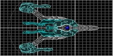
alright, heres what i got now, color scheme isn't to great i think, i'll fiddle with it later, I've only put on 4 point defenses, 2 beams at the ends of the wings, a dual laser on the nose and a little pop gun like thing on the back
She's called the Artemis

I'm trying to go throught the A's before i start the other letters
Posted: Wed Dec 23, 2009 11:54 am
by inteuniso
Better. However, I still see stretched sections. You can still make your ship look this way, you just have to find the right sections to do it with. Just think of sections like an image: You can always go smaller, but never make it larger. If you stick to that rule, you should be fine.
Also, with your color scheme, you can just stick to monotone right now. Genetally, if you can master the shades of gray, you can shift over to color without much problem.
One final tip, if you haven't done so already, look at the Holy Ship! thread, and in the allied data archives in the metagame. You shouldn't try to mimic those styles, but you should look at what they did, and see how they did it, to improve your own ships. Don't worry, if you keep on trying, you'll be able to put out at least a decent ship.
Posted: Wed Dec 23, 2009 11:56 am
by Kiltric
It's a definite improvement in your skill, though has a ways to go before I'd call it good.
Frankly, the easiest thing for you to do is just lurk a bit, look around at some of the threads in this section, especially the Holy Ship thread. Anna's Workshop is also a good place to get a sense of what is and is not good.
Keep at it.
Posted: Wed Dec 23, 2009 12:55 pm
by Link
actually i didn't stretch any of it this time, its all normal size
I'm going to look at that stuff
Posted: Wed Dec 23, 2009 8:02 pm
by god froggy
making a ship look good with stretched sections is hard. Unless you take a good ship and shove a stretched section to the very bottom with alpha set to 0.
But try changing the colours too. And download some SW sprites. They look much better than general BF sprites. Not bad for a first attempt.
Posted: Wed Dec 23, 2009 9:23 pm
by adelbert60
Link wrote:actually i didn't stretch any of it this time, its all normal size
I'm going to look at that stuff
I’m pretty sure you maximized your ship maker, because the squares in the background are rectangular. Maybe that's why the sections look stretched. Just run your ship maker in windowed mode.
Posted: Wed Dec 23, 2009 9:40 pm
by god froggy
yeah thats the problem. Just leave the window as it is. With my laptop it means it runs off the top and bottom of the screen but I have miles off space at the sides. It doesn't matter though.
Posted: Thu Dec 24, 2009 5:07 am
by Link
alright, i'll try that stuff, and i'll try to get those sprites.
edit. umm, where exactly can i find some more good sprites? the only other ones i can find are things like missles, bridges and ... ya thats pretty much it. Also, i don't know what your abreviations mean yet, i see sw i think star wars
Posted: Fri Dec 25, 2009 10:22 am
by Corporal Jomn
Here, use this DL.
http://individual.utoronto.ca/Squishy/S ... sueSWA.rar
It has the most SWA sections, which are far superior to the normal sections, and has an .ini file with 'em, should make your life easier.
Posted: Fri Dec 25, 2009 3:18 pm
by Napalm
Gah. reminds me of the VERY first time i started BSF.
Definite improvement though.
Posted: Mon Dec 28, 2009 1:18 am
by Link
sweet, i'll see what i can do

