Archives for ships and fleets. 'nuff said. Most of the ships here are very very old and will not work in current versions of BSF or SM. You have been warned!
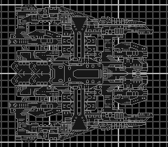
Okay so I've decided to like my writing just let my "hand" lead it self. This is the product. Well personally I think its just a front section to a ship. I would love to know what you think of it. This is despite being my most random, also my best piece of Battleships forever work yet.
So I hope you leave a comment and tell me what i Can fix or what you like or don't like about it. I also realize its just gray. If I get around to finishing this I will color it accordingly.
512 letters is not a license to use nearly a dozen lines.
[size=75]Besides, that was even worse than what Melvin had.[/size]
The second I saw it I thought is was a bulked up Cronus.
The all gray looks very boring, other colors could bring out the detail a bit more.
The problem with just building a ship as you go, not thinking about what it's supposed to be is that your ship ends up looking like it exists for the sake of existing, with no real purpose in mind. Everything just jumbles together, with no apparent though given to why the section should go there. For example, the gaps in the wings near the back would make sense if, say, you had a generator that was being exposed for the purpose of venting. As it is, they are just holes.
Got Steam?
Join the official BSF Steam group today!
Sign up [url=http://steamcommunity.com/groups/wyrdysm]here![/url]
Custom sections not working? Just open a window, click on the image fo the section you want, and drag it over to the Shipmaker window and it will appear. Not as intuitive as the Z key, but it works all the same.
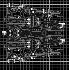
Also, I would reccomend recoloring the back pair of section 4's so that they looks like they're "below" the front pair of section 4's. Still pretty cool though. A big, ugly (in a good way) bruiser.
Agreed, but I posted more for design then color. Since If i were to take time and color I'd never finish any of my ships. Thanks for the feedback as well, I'll try and incorporate it.
512 letters is not a license to use nearly a dozen lines.
[size=75]Besides, that was even worse than what Melvin had.[/size]
Well It's hard to tell but I have darkened a few sections to give a sense of depth. I may edit this shortly and exaggerate the color change so its more obvious in the picture. Also I've added weapons tell me what you think of that as well.
512 letters is not a license to use nearly a dozen lines.
[size=75]Besides, that was even worse than what Melvin had.[/size]
It's better now, but it's still cluttered as fuck and blocky as hell. Some color could also be quite beneficial.
Check out The Star Wreck project! Check out the Epic Music Library And in this Alliance we bestow our hope and will, that the Dogs of War may never harass the people of our homes again, and that it will bring peace, equality and liberty for all in need and despair. One Universe, One Goal. By the Manifest we command this.~ Saren Vil Ush
He's right.
one color never looks good on ships, try a color sceme with two or three diferent colors.
And spead out the wepoens and stuff or start smaller with a fighter or a light frigate or something.
But other than that ok job.