Long time lurker shares his stuff, mini update 12/31
Moderators: th15, Moderators
Blackhart: Yeah it was intentional, I thought it looked cool
Squishy : One part, I didn't know how, Two parts, I want to polish em a bit, One part, I want to finish the fleet = My explanation
XEALMOX: Uh, all I did was take a section, rectangular or one of the wings, make it very skinny, and place them right next to each other either 3 or four "clicks" apart.
Well, I finished two smaller ships and working on a large station at the moment. I'll probably have those up tonight, and have download links for the others later.
Again, thanks for the feedback guys.
-
Dr. Strangelove
- Lieutenant, Junior Grade

- Posts: 13
- Joined: Wed Apr 30, 2008 4:57 pm
The Assent, Bulwark, and Longbow are the only ships that really stand out to me; the others aren't bad, but they don't grab me.
The stations are another matter - I love those things! The asymmetrical construction and shield arcs are fantastic.
The stations are another matter - I love those things! The asymmetrical construction and shield arcs are fantastic.
[url=http://www.wyrdysm.com/phpBB2/viewtopic.php?t=2921][img]http://i30.photobucket.com/albums/c348/DraTuicichNovae/AESig.png[/img][/url]
-
Ingens Remus
- Lieutenant Commander

- Posts: 67
- Joined: Sat Nov 15, 2008 9:33 am
-
Exethalion
- Vice Admiral

- Posts: 1033
- Joined: Tue Nov 13, 2007 6:36 pm
- Location: Stuttgart, DE
- Contact:
-
Himura.Kenshin
- Rear Admiral

- Posts: 887
- Joined: Fri Sep 28, 2007 11:35 pm
- Location: Below My Postcount
Ah shoot, you are right Himura.Kenshin. Man, I hate messing with depths, maybe I'm just a little dumb, but they always confuse me and they take forever.
Well working on the mothership/main station now. Haven't quite decided which yet, considering it could go both ways.
Thanks for the feedback everyone.
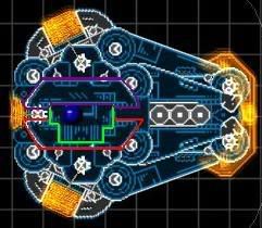
...And Now, for your consideration....The Praefectus

The Praefectus is a moving space station with the sole purpose of eliminating entire fleets. Taking its power from two, hyper dense, man-made stars, the Praefectus is capable of speed, turning, and acceleration only seen in the nimblest of fighters. Its armaments launches swarms of rockets, and its main cannon can pierce near any hull.
I'll probably edit it, as I am not completely satisfied with it, but I just thought I'd share for some feedback on making it better. It is my flag ship after all.
Well working on the mothership/main station now. Haven't quite decided which yet, considering it could go both ways.
Thanks for the feedback everyone.
...And Now, for your consideration....The Praefectus

The Praefectus is a moving space station with the sole purpose of eliminating entire fleets. Taking its power from two, hyper dense, man-made stars, the Praefectus is capable of speed, turning, and acceleration only seen in the nimblest of fighters. Its armaments launches swarms of rockets, and its main cannon can pierce near any hull.
I'll probably edit it, as I am not completely satisfied with it, but I just thought I'd share for some feedback on making it better. It is my flag ship after all.
-
TheShipwrightArms
- Lieutenant Commander

- Posts: 51
- Joined: Mon Dec 15, 2008 3:26 am
Ehh. It's imposing, but there's a bunch of areas with poor layering/section placement choices. Besides... it's just flat out ugly as hell.
I do like the blue "mini-sun" cores, though.
I do like the blue "mini-sun" cores, though.
[url=http://www.wyrdysm.com/phpBB2/viewtopic.php?t=2921][img]http://i30.photobucket.com/albums/c348/DraTuicichNovae/AESig.png[/img][/url]
-
ArcaneDude
- Fleet Admiral

- Posts: 2520
- Joined: Sun Jan 27, 2008 4:50 am
- Location: Antwerp, Belgium

