Supreme Commander Cybran T3 Battleship

Archives for ships and fleets. 'nuff said. Most of the ships here are very very old and will not work in current versions of BSF or SM. You have been warned!

Moderators: th15, Moderators

Slayer0019
Commodore
Commodore
Posts: 535
Joined: Mon Jul 21, 2008 1:04 pm
Location: CT, America

Supreme Commander Cybran T3 Battleship

Post by Slayer0019 »

Another ship replicated from Supreme Commander, I present the Cybran Galaxy Class.
This took way longer than I expected. I Made stats as close to the originals as possible while still maintaining the powerful BSF feel of battles. Weapons are, I believe, very close to the actual armaments.
If people are interested I'll post a download link.
Image
Image
Image
C&C Welcome, as usual.
Got Steam?
Join the official BSF Steam group today!
Sign up [url=http://steamcommunity.com/groups/wyrdysm]here![/url]

[img]http://i192.photobucket.com/albums/z148/JohnDG/sig-1.png[/img]
Kurusunami
Lieutenant, Junior Grade
Posts: 20
Joined: Sun Dec 14, 2008 9:24 am
Location: Hiding in the light.
Contact:

Post by Kurusunami »

I wanna shoot my Pilum at it and see what happens. Link!

That is awesome. I've seen Sera's ships, but he's too leet for me, or anyone else to beat. I wish I could get that good IN A REASONABLE AMOUNT OF TIME. Teach me.
"The more one seeks perfection, the easier it is to lose oneself in useless thoughts. This sort of person would find it hard to succeed, let alone have an opportunity to fail." -Rokujou Miharu

Take Miharu's advice. You'll thank me for it later.
LTfoxfire
Lieutenant
Lieutenant
Posts: 35
Joined: Sun Nov 23, 2008 2:57 am

Post by LTfoxfire »

Looks almost like the ship off of Starship troopers. The coloring works well enough. I want to ask when is the best way to choose when to shade sections to show depth? You did a pretty good job outlining the sections off, and you seem to enjoy creating larger vessels. Any pointers, that you can show in your design, that may be of help to me and others?
If you have a car that can go the speed of light, don't bother to turn the headlights on.
Kurusunami
Lieutenant, Junior Grade
Posts: 20
Joined: Sun Dec 14, 2008 9:24 am
Location: Hiding in the light.
Contact:

Post by Kurusunami »

Alright, back to true recommendations.

Sometimes the pieces sticking off are badly done. I realized this problem on my pilum, the forward piece I put looked very out of place. On yours, it's like you suddenly went from thick, clear lines to thin, grainy lines that are brighter and draw bad attention. If the ship's looked at for more than a passing second the eyes are drawn to those parts. You could use a naturally (By default) smaller piece that has the general same shape. They're also apparently in numerous other places in the hull.
[That was a bit long-winded over a small issue, sorry if you think I'm nitpicking, but I find the small things go a huge distance. Like simply coloring, bolding, and formatting tooltips makes the difference between your game looking professional or your game being a slapped-together piece of crap.]
"The more one seeks perfection, the easier it is to lose oneself in useless thoughts. This sort of person would find it hard to succeed, let alone have an opportunity to fail." -Rokujou Miharu

Take Miharu's advice. You'll thank me for it later.
Squishy
Rear Admiral
Rear Admiral
Posts: 852
Joined: Mon Dec 03, 2007 4:32 am

Post by Squishy »

This is a very faithful rendition, however you must be aware that some of the sections are a bit more pixelized than other sections due to stretching. This causes a garring effect on my eyes as I move my sight across the ship as parts of the ship shift from fine granularity to course granularity. It is taking a great deal of aesthetics out of your otherwise excellent ship.


If you have time, go back across the ship once more and play with the sections that are most stretched so that they do not stand out too much amongst their neighbors. You may need to substitute a one or more pieces to fill in any gap cause by unstretching some problem sections. Your goal is to maintain an overall fineness across your ship.


Your ship also suffers from repetition of sections, however I feel this may have been necessary due to it being made to accurately represent the Cybran Galaxy Class. Once you're done with fixing the stretching, see if you can mix up and vary those long, linear patterns of sections
Slayer0019
Commodore
Commodore
Posts: 535
Joined: Mon Jul 21, 2008 1:04 pm
Location: CT, America

Post by Slayer0019 »

Thanks for the feedback, and I understand what you mean about the stretched parts. Part of the reason I did that was to stay as close as possible to the actual lines and contours of the Galaxy Class. That meant having to mix smooth plates in with more complicated arrangements.
Here's my reference pic, to better illustrate what I'm saying.
Image
Got Steam?
Join the official BSF Steam group today!
Sign up [url=http://steamcommunity.com/groups/wyrdysm]here![/url]

[img]http://i192.photobucket.com/albums/z148/JohnDG/sig-1.png[/img]
Kurusunami
Lieutenant, Junior Grade
Posts: 20
Joined: Sun Dec 14, 2008 9:24 am
Location: Hiding in the light.
Contact:

Post by Kurusunami »

The repetition's excusable, it's a fanship. But yes, there's a need to sacrifice a bit of shape for aesthetics. Use a different section for those grainy ones.

What game is that from? Looks fun. Looks kinda like Homeworld.
"The more one seeks perfection, the easier it is to lose oneself in useless thoughts. This sort of person would find it hard to succeed, let alone have an opportunity to fail." -Rokujou Miharu

Take Miharu's advice. You'll thank me for it later.
Slayer0019
Commodore
Commodore
Posts: 535
Joined: Mon Jul 21, 2008 1:04 pm
Location: CT, America

Post by Slayer0019 »

Supreme Commander, and yes, it is fun. Take any RTS game you've ever played and multiply its scale by 20. Maps can be as large as 40 square miles.
Got Steam?
Join the official BSF Steam group today!
Sign up [url=http://steamcommunity.com/groups/wyrdysm]here![/url]

[img]http://i192.photobucket.com/albums/z148/JohnDG/sig-1.png[/img]
User avatar
Arcalane
Pseudofeline Overlord
Posts: 4034
Joined: Thu Sep 13, 2007 10:37 am
Location: UK

Post by Arcalane »

40 square miles? The largest maps in SupCom are 80km by 80km. That's more like 50 square miles. Well, 49.7096954 to be precise.
  /l、
゙(゚、 。 7
 l、゙ ~ヽ
 じしf_, )ノ
Smut
Lieutenant, Junior Grade
Posts: 20
Joined: Sat Dec 13, 2008 11:18 pm

Post by Smut »

To get back on topic (no offense), this ship is great. It's really big and I like the custom weapons on it. However, some of the sections are stretched a lot, and it's a bit ugly.
Kurusunami
Lieutenant, Junior Grade
Posts: 20
Joined: Sun Dec 14, 2008 9:24 am
Location: Hiding in the light.
Contact:

Post by Kurusunami »

I don't see anything stretched... Shrunk, yeah, which is bad, but we already had that. Faithful recreation of ship, good job, let's talk about big RTS's. Homeworld2's maps are HUGE.
"The more one seeks perfection, the easier it is to lose oneself in useless thoughts. This sort of person would find it hard to succeed, let alone have an opportunity to fail." -Rokujou Miharu

Take Miharu's advice. You'll thank me for it later.
User avatar
Arcalane
Pseudofeline Overlord
Posts: 4034
Joined: Thu Sep 13, 2007 10:37 am
Location: UK

Post by Arcalane »

Then you're not looking hard enough. :P

Looks accurate to the original, relatively speaking, though the turrets look a bit weird and could probably do with some colour variation and perhaps some mild outlining to make them stand out more.
  /l、
゙(゚、 。 7
 l、゙ ~ヽ
 じしf_, )ノ
SHAD0Wdump
BANNED
Posts: 413
Joined: Thu Nov 06, 2008 9:35 pm

Post by SHAD0Wdump »

This is certainly well done... I'd even go as far to say that you've made it look more cybran than the original.
Kurusunami
Lieutenant, Junior Grade
Posts: 20
Joined: Sun Dec 14, 2008 9:24 am
Location: Hiding in the light.
Contact:

Post by Kurusunami »

There seems to be a large amount of empty space. Hullmeat needed. Try using a white background in shipmaker to spot the gaps. Slight variations in the shades of black and red would also make it look better.
"The more one seeks perfection, the easier it is to lose oneself in useless thoughts. This sort of person would find it hard to succeed, let alone have an opportunity to fail." -Rokujou Miharu

Take Miharu's advice. You'll thank me for it later.
Slayer0019
Commodore
Commodore
Posts: 535
Joined: Mon Jul 21, 2008 1:04 pm
Location: CT, America

Post by Slayer0019 »

Kurusunami wrote:There seems to be a large amount of empty space. Hullmeat needed.
Lolwut? The only empty spaces are in the back, where there actually are empty spaces.
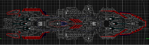
Arcalane wrote:the turrets look a bit weird and could probably do with some colour variation and perhaps some mild outlining to make them stand out more.
Agreed.
Arcalane wrote:The largest maps in SupCom are 80km by 80km. That's more like 50 square miles. Well, 49.7096954 to be precise.
Close enough. If nothing else, the extra 10 square miles only strengthens my point.

Homeworld and Sins of a Solar Empire are immediately discounted from any discussions of scale due to the fact that they take place in space.
Smut wrote:However, some of the sections are stretched a lot, and it's a bit ugly.
Actually none of the parts are really stretched all that much. The 22s behind the bridge are only sized up 2 or 3 "clicks" in either direction. The rest is just shrunk, which kind of throws the scale.
As for ugliness, blame Brackman. He designed it.
Got Steam?
Join the official BSF Steam group today!
Sign up [url=http://steamcommunity.com/groups/wyrdysm]here![/url]

[img]http://i192.photobucket.com/albums/z148/JohnDG/sig-1.png[/img]
Locked