First ship

Archives for ships and fleets. 'nuff said. Most of the ships here are very very old and will not work in current versions of BSF or SM. You have been warned!

Moderators: th15, Moderators

Locked
Sun
Ensign
Ensign
Posts: 5
Joined: Sat Aug 07, 2010 9:14 am

First ship

Post by Sun »

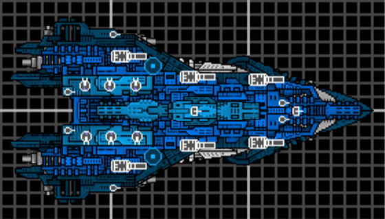
Okay, not technically my first ship but my first good attempt at a custom ship after perusing these forums for awhile. Not sure if I'm supposed to name what class of ship it is or anything, I didn't really aim for anything specific. Just made a ship I thought looked nice. I named it the Hurricane.
v1:
Image
v2:
Image
v3:
Image
Last edited by Sun on Sat Aug 07, 2010 8:39 pm, edited 3 times in total.
inteuniso
Commander
Commander
Posts: 207
Joined: Sun Jul 19, 2009 1:31 am

Re: First ship

Post by inteuniso »

It's not bad. I don't think maroon would be a nice color, but whatever you want.

It's a good ship for a first post, better than some of the crap put on this forum. The centerpiece that is asymmetrical looks off, but other than that, it looks alright.
It's not my fault I can't take your post seriously.
User avatar
calvin1211
Commodore
Commodore
Posts: 720
Joined: Wed Apr 07, 2010 7:12 pm

Re: First ship

Post by calvin1211 »

It's quite nice. Good stuff for a first ship. Depthing is somewhat wierd though.
Sun
Ensign
Ensign
Posts: 5
Joined: Sat Aug 07, 2010 9:14 am

Re: First ship

Post by Sun »

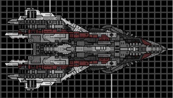
Thanks for the replies guys, I went ahead and finished coloring the whole thing how I liked, and yes i still did choose maroon, mostly due to the fact that the inspiration for this ship is also a maroon color. I also fixed the asymmetrical piece in the middle, thanks for pointing that out. Oh and I added team colors as well (it looks quite nice in red).

I also armed it, it now possesses 6 front facing autocannons and 3 repeaters on each side to protect the flanks. It also has 2 flak cannons and some particle guns for defense. To balance it out the HP is somewhat low and it has very slow turning. This balances the massive forward facing damage by allowing smaller ships to get around to its flanks.

Added the pic into the first post for easy viewing.

Oh and just a fun fact, if anyone plays or has played eve online, this ship is a loose replica of the namesake from that game. Mostly the shape, color, and autocannons were what I tried to reproduce. Here's a pic, and remember I said loose replica: http://games.chruker.dk/eve_online/grap ... 8/3135.jpg
User avatar
Anna
The artist formerly known as SilverWingedSeraph
Posts: 3447
Joined: Wed Sep 26, 2007 8:51 pm
Location: Elsewhere

Re: First ship

Post by Anna »

But... it looks nothing like the Hurricane.

And that colour scheme is awful. Highly saturated colours are bad except in very small amounts. And you still want to keep some grey areas, ideally. And for a sense of three-dimensional depth, you should use brighter shades on top and darker shades for areas of the ship that are meant to be lower.

And that's my small portion of helpful advice for today.
Founder and Event Coordinator for the BSF Beauty Pageant. Founder of the Pseudo-Chainship Project. Admin. Games Master.
Quality Control Enforcer
Gay cute girl and fucking proud of it.
Sun
Ensign
Ensign
Posts: 5
Joined: Sat Aug 07, 2010 9:14 am

Re: First ship

Post by Sun »

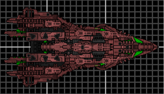
Well, the general angular shape and the color somewhat resemble the hurricane. Anyway, the color scheme as far as I'm aware is a matter of personal preference, as is my choice of leaving out greys. I like a singular colored scheme that makes good use of shading and blending. And on that note, I also did use darker shades at the bottom and lighter at the top, but the difference is minimal at best I suppose. I couldn't really make the lighter shades any lighter or else they became a salmon color instead of a maroon color and well, that just looked pretty terrible. I will look into lowering the saturation a bit and seeing how that looks, though.

Okay so I played around a bit, I assume you mean something like this:

v3
Image

I also changed up some of the weaponry and added thrusters for all maneuvering.
Droid
Vice Admiral
Vice Admiral
Posts: 1173
Joined: Mon Jan 07, 2008 2:07 pm
Location: Canada

Re: First ship

Post by Droid »

please please please please please don't use stock weapons on TSA sections
vidboi
Tournamentator
Tournamentator
Posts: 669
Joined: Mon Mar 08, 2010 5:14 am
Location: UK

Re: First ship

Post by vidboi »

what droid said. stock and tsa really don't mix well. try using weapons such as horsemonsters or se7erns which are good replacements for use with shipwright sections. also, even if you don't want to use grey, please do use less saturated colours, as the ones you are using are a lightle too light to look good with tsa sections. the ship intslef could do with some more contrasting shading to pick out sections of the hull and create interest in certain areas. the grey bits need to depthed better relative to the rest of the ship (they tend to be too light, especially the thrusters) and you could try building artistic turret mounts for your weapons to make them more aesthetically pleasing. other than that, keep up the good work! =D
There is no OP, there is only more boosters...
Locked