Amazing work good sir. Triggers and crap have never been my thing but you've managed to make the arms work very well.
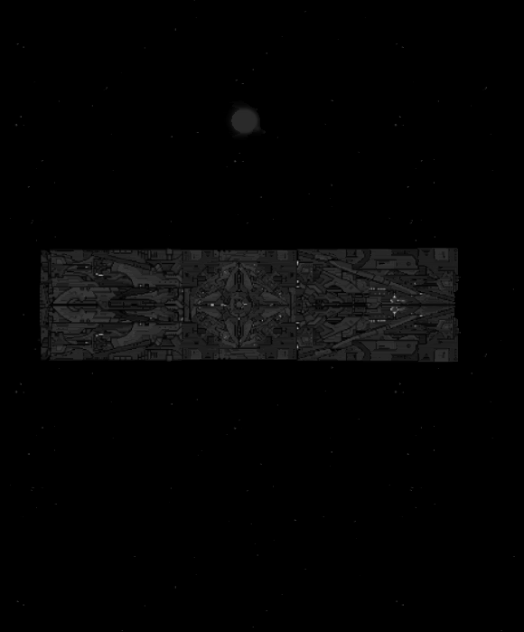
To top it off, the ship has an amazing functional look that is pleasing to the eye.
I'd like to see this ship in a dark green color scheme.
Search found 480 matches
- Tue Jul 13, 2010 6:10 am
- Forum: Custom Designs & Ships
- Topic: Workbee & Co - Wreckerbee and Minibee Downloads On Page 5
- Replies: 97
- Views: 48627
- Sun Jul 04, 2010 12:07 am
- Forum: Ship Archive
- Topic: My Junkyard
- Replies: 7
- Views: 15837
Re: My Junkyard
The color scheme itself is fine IMO. The problem is that the colors haven't been used in a very effective way to make the ship interesting or show depth. The ship is generally bland. I'd reconsider the shape of the gray section you have on your ship. The orange front looks like it's been glued onto ...
- Sun Jun 20, 2010 1:27 am
- Forum: Ship Archive
- Topic: Long time no do ship. Pelicun USP & Bear Rim Fleets
- Replies: 20
- Views: 30023
Re: Long time no do ship. Pelicun USP & Bear Rim Fleets
http://i288.photobucket.com/albums/ll16 ... nsform.gif
Holy Crap!
Dood!,those are some seriously awesome transformers.
I've GOT to try these out.
Holy Crap!
Dood!,those are some seriously awesome transformers.
I've GOT to try these out.
- Sat Jun 19, 2010 6:09 am
- Forum: Custom Content & Sprites
- Topic: List of correct sprite pack names Updates on first page.
- Replies: 26
- Views: 12080
Re: List of correct sprite pack names
Thanks for taking the time to do this.
I find this quite useful. I'm also looking forward to the downloads.
- Sat Jun 12, 2010 5:24 am
- Forum: Ship Archive
- Topic: Another newb with ships
- Replies: 49
- Views: 52426
Re: Another newb with ships
Orange would fit just fine but w/e. The newest color scheme has way too much contrast. It would do you good do desaturate the green. Tbh, the blue part isn't really doing much for it. The random ships lack good shapes IMO. http://img820.imageshack.us/img820/7493/smscreen04.png This one is actually o...
- Sat Jun 12, 2010 5:15 am
- Forum: Ship Archive
- Topic: Colorful Random Thingy
- Replies: 3
- Views: 8785
Re: Colorful Random Thingy
I don't like the red and yellow skittles so I avoided putting them in.Yeah, you lack red and yellow for skittles IMO.
- Fri Jun 11, 2010 9:26 am
- Forum: Ship Archive
- Topic: Colorful Random Thingy
- Replies: 3
- Views: 8785
Colorful Random Thingy
Green-Purple-Orange my favorite color scheme.
Guess what I like to call it? Skittles. lol
- Fri Jun 11, 2010 5:51 am
- Forum: Ship Archive
- Topic: Another newb with ships
- Replies: 49
- Views: 52426
Re: Another newb with ships
How would purple not help?
I mean ever heard of green-purple-orange?
- Fri Jun 11, 2010 12:31 am
- Forum: Ship Archive
- Topic: Another newb with ships
- Replies: 49
- Views: 52426
Re: Another newb with ships
The overall structure of the ship looks too flimsy.
Change those yellow sections to purple. Some more gray may also help.
- Sun Jun 06, 2010 10:37 pm
- Forum: Ship Archive
- Topic: Building Ships From The Inside Out
- Replies: 5
- Views: 10459
Re: Building Ships From The Inside Out
Dude, that's awesome. I personally really like the ship as well as the inside-out thing. While it's rather cluttered, you've managed to achieve a more 'realistic' feeling with it. Epic work.
I would really, really, really, like a download.
- Thu Jun 03, 2010 4:57 am
- Forum: Custom Designs & Ships
- Topic: Random acts of violence with Shipmaker
- Replies: 484
- Views: 497604
Re: Necro from page 3
@Anna: Too small to really have a noticeably bad rhythm. Either way, 'noise' was rather ironic.
- Thu Jun 03, 2010 2:42 am
- Forum: Custom Designs & Ships
- Topic: Random acts of violence with Shipmaker
- Replies: 484
- Views: 497604
Re: Necro from page 3
The weapons/details create too much noise.
I'd change the brighter green to orange and possibly lighten up the darkest of greens.
You've got a nice structure going. You've just added too many unnecessary details and totally killed the composition.
I'd change the brighter green to orange and possibly lighten up the darkest of greens.
You've got a nice structure going. You've just added too many unnecessary details and totally killed the composition.
- Wed Jun 02, 2010 1:26 am
- Forum: Ship Archive
- Topic: Rodgun's Ships
- Replies: 51
- Views: 26394
Re: Rodgun's Ships
The battleships is way to choppy. None of the sections transition well to the other resulting in a cut and paste look. Much of the ship also (I hate to say it) lacks flow so my eye gets lost in the jumble of sections. The fact that the depthing isn't really there doesn't help matters. The colors als...
- Sat May 29, 2010 5:04 am
- Forum: Custom Designs & Ships
- Topic: Alive series spaceships
- Replies: 35
- Views: 9648
Re: Alive series spaceships_authority of radial
I rather like the big station. Reminds me of a kaleidescope.
You've also managed to use the aegis lines pretty well too.
I'm not too sure about what or how the jumpgate works. You've zoomed too far out on it.
You've also managed to use the aegis lines pretty well too.
I'm not too sure about what or how the jumpgate works. You've zoomed too far out on it.
- Sat May 22, 2010 9:44 pm
- Forum: Ship Archive
- Topic: Annoying Guy Doing Ships Again
- Replies: 7
- Views: 2935
Re: Annoying Guy Doing Ships Again
You're not annoying, I'm annoying. :D Anyhow, you've got too much contrast between the light and dark gray sections. It's not eyeburnish but it doesn't look attractive either. The front Kae_sml section also looks like it was super-glued on and could fall off any minute. I'd suggest using some of TSA...