Here and back again.

Archives for ships and fleets. 'nuff said. Most of the ships here are very very old and will not work in current versions of BSF or SM. You have been warned!

Moderators: th15, Moderators

User avatar
Blackhart
Captain
Captain
Posts: 326
Joined: Sat Jul 12, 2008 4:50 am

Here and back again.

Post by Blackhart »

Well I am back and making ships again. I have been lurking around for the past few months and I have had a few brain farts that gave me a few more ideas for some ship designs.

These two I built just last week. I was just sort of experimenting with TheShipwrightArms' sprites just to see what I could come up with. They both lack a decent colouring job, but hopefully their section work and use of glows make up for that :wink:.

Image

Image

So yeah, there are more ships to come.
jwa8402
Admiral
Admiral
Posts: 1988
Joined: Tue Feb 26, 2008 9:09 am

Post by jwa8402 »

The second one especially has very nice flow. I like the detail work in it, and the spaced gaps. Seems like the core is a bit exposed between the front and back gaps though. Maybe add a section or two between the Ura_7s to make the nose gap a bit shorter?
User avatar
Blackhart
Captain
Captain
Posts: 326
Joined: Sat Jul 12, 2008 4:50 am

Post by Blackhart »

Maybe something along the lines of this?

Image
Doogie12
Admiral
Admiral
Posts: 1508
Joined: Sun Aug 30, 2009 1:14 am
Location: Castle Anthrax

Post by Doogie12 »

that is some pretty nice stuff I see there. I think this is how those sprites are meant to be used. Keep up the good work
naysayers will be shot
jwa8402
Admiral
Admiral
Posts: 1988
Joined: Tue Feb 26, 2008 9:09 am

Post by jwa8402 »

Ya even that small change helped alot. I really like the light over dark you got going there. Eliminates the need to have many levels of shading but actually gives a better sense of depth.
User avatar
Blackhart
Captain
Captain
Posts: 326
Joined: Sat Jul 12, 2008 4:50 am

Post by Blackhart »

I conjured up this cuiser yesterday.

The Ibirujo

Image

Any thoughts?
AidanAdv
Commodore
Commodore
Posts: 583
Joined: Fri Feb 15, 2008 6:49 am
Location: The Fields of Justice

Post by AidanAdv »

Very nice, but I gotta say I like the front part of the ship more than the back. It just seems like the front flows better. Reminds me of the spindly look of some AD's stuff.

Not much else that really occurs to me, overall quite nice.
The walls have eyes: the shadows we throw are the shadows we try to throw off.
Imaillusion
Captain
Captain
Posts: 355
Joined: Sat Nov 28, 2009 8:57 am
Location: Thin air

Post by Imaillusion »

I like the beige-like colouring of some of the sections on that lastest ship. It compliments the subtle shades of grey and those bits of blue part very well. Its... kinda soothing to look at, if you know what I mean
Those that live by the sword... get shot by those that don't.
User avatar
HorseMonster
Commander
Commander
Posts: 236
Joined: Fri Aug 28, 2009 9:24 am

Post by HorseMonster »

Blackhart wrote:I conjured up this cuiser yesterday.

The Ibirujo

Image

Any thoughts?
I like it alot, but it seems to lack any discernable engines and the back part seems a bit empty.
User avatar
Blackhart
Captain
Captain
Posts: 326
Joined: Sat Jul 12, 2008 4:50 am

Post by Blackhart »

Heres a new ship, its actually a remake of another ship I made a few months back around the time I sort of disappeared :oops:.

Here is the old one.
Image

And here is the new one!
Image

I personally like the new one allot better, it is far less cluttered and I actually took the time coloured it a bit. The old one would probably look slightly better if I actually took off the weapons however.
HorseMonster wrote: I like it allot, but it seems to lack any discernable engines and the back part seems a bit empty.
Okay, how about this?
Image
Cycerin
Captain
Captain
Posts: 395
Joined: Fri Nov 09, 2007 3:13 am

Post by Cycerin »

Damn Blackhart, this is really excellent. I absolutely love spaced armor plates over substructure, and you've done it so well.
User avatar
Arcalane
Pseudofeline Overlord
Posts: 4034
Joined: Thu Sep 13, 2007 10:37 am
Location: UK

Post by Arcalane »

Blackhart wrote:Heres a new ship, its actually a remake of another ship I made a few months back around the time I sort of disappeared :oops:.

Here is the old one.
Image

And here is the new one!
Image

I personally like the new one allot better, it is far less cluttered and I actually took the time coloured it a bit. The old one would probably look slightly better if I actually took off the weapons however.
I dare say #2 suffers from a touch too much Generic2, but that might just be me. I like #1's engine setup better, and it looks a bit more solid - that break in #2 makes it look like the aft block could snap off at the drop of a hat.

On the other hand, yeah, #1 does look a bit cluttered and messy.
Rodgun
Lieutenant Commander
Posts: 74
Joined: Mon Jan 18, 2010 4:11 am
Location: Infront of a computer.

Post by Rodgun »

Hey Arcalane, let me ask you something. I understand that a ship should be built with a diversity of parts instead of repeating over and over, but what is the problem with using too many Generic 2 parts?
User avatar
Arcalane
Pseudofeline Overlord
Posts: 4034
Joined: Thu Sep 13, 2007 10:37 am
Location: UK

Post by Arcalane »

Rodgun wrote:Hey Arcalane, let me ask you something. I understand that a ship should be built with a diversity of parts instead of repeating over and over, but what is the problem with using too many Generic 2 parts?
They are visually 'flat' and don't look as pleasing, visually, as other sections, because they are lower-detail. That's not to say they're bad, period, just that you have to be careful how you use them.

You can use them, like this and be fine.

But what you shouldn't do is this. Someone else might be able to better articulate what I'm trying to say though.
User avatar
Anna
The artist formerly known as SilverWingedSeraph
Posts: 3447
Joined: Wed Sep 26, 2007 8:51 pm
Location: Elsewhere

Post by Anna »

Arcalane wrote:You can use them, like this and be fine.
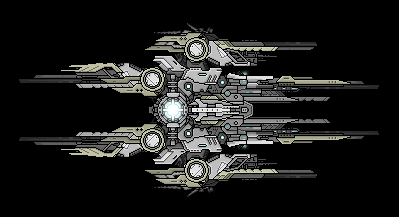
I dunno. That looks way too flat and bland to me. I don't really see how it's much of an improvement over the second screen you posted. Both use way too many flat, bland, uninteresting sections.

As to why you shouldn't use them a lot. Well. They're called generic sections for a reason. Any ship made purely out of them is going to look damn generic, and relatively uninteresting, without some really, really classy section usage.

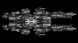
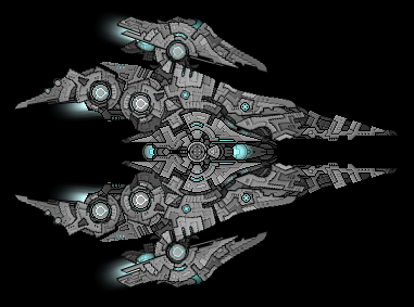
Also, Blackhart, while the newer one looks a lot cleaner and less cluttered, I over-all prefer the design of this:
Image

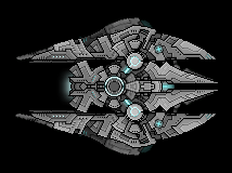
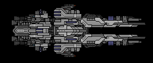
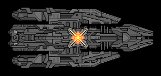
This thing is great, though:
Image
Very, very nice. Very clean. Seems to be lacking a little, though... I don't really know for sure what. Seems like it could do with some more detailed bits that look like they might have some purpose other than decoration, I guess. Maybe that's just me.
Founder and Event Coordinator for the BSF Beauty Pageant. Founder of the Pseudo-Chainship Project. Admin. Games Master.
Quality Control Enforcer
Gay cute girl and fucking proud of it.
Locked